A new face for a 21st century city
Santa Monica is an iconic beachside city on the westside of Los Angeles County. Offering an environment of unparalleled natural beauty, the city is home to a mix of residential communities, commercial districts, and recreational venues. Looking to create a concept for a service-focused digital town hall and brand experience, they turned to Edenspiekermann.
The challenge:
The City of Santa Monica is a full-service city. City departments include police, fire, transportation, a school district, parks & recreation, building & planning, waste management and economic development to name a few. Additionally, the City is renowned for the multitude of publicly funded services such as free public wifi, a high speed fiber optic network, cultural venues & programs, educational services and affordable housing.
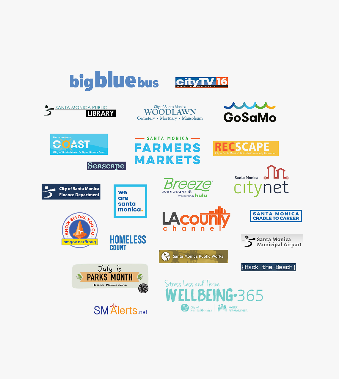
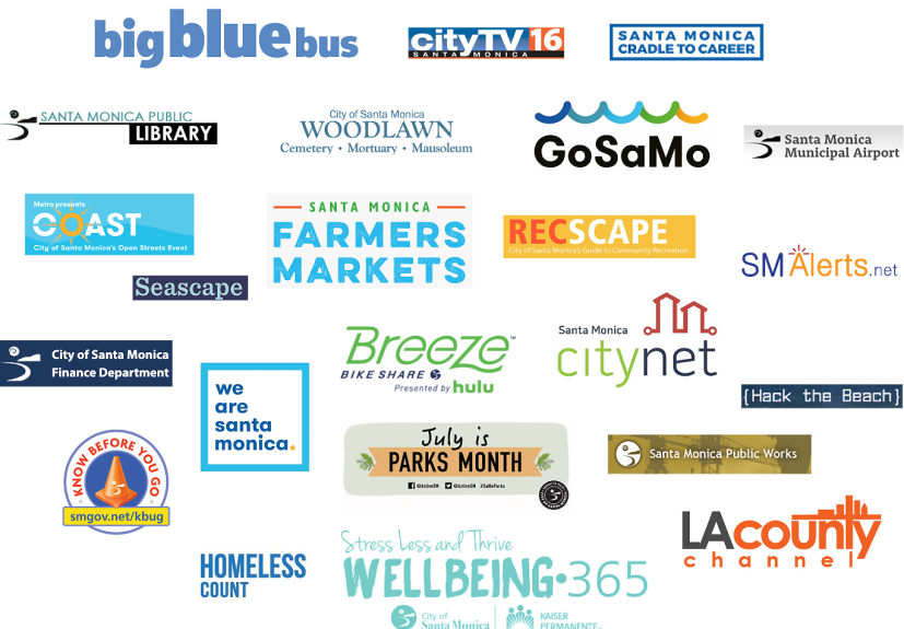
However, the visibility and accessibility to these services—especially in a digital context—was not always clear, or easy. Departments operated in silos, meaning that critical information was often buried on individual department websites, making it difficult for users to find what they needed. Additionally, many of the departments, programs and initiatives had their own individual brand identities and microsites, making it challenging for users to know what services were actually being offered by the City.
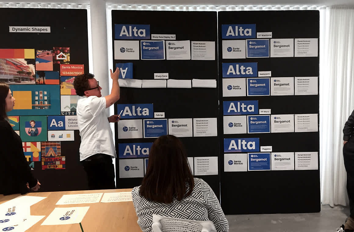
Close collaboration with the City stakeholders, individual departments, and the public was key to the project.

From department-oriented to topic-oriented
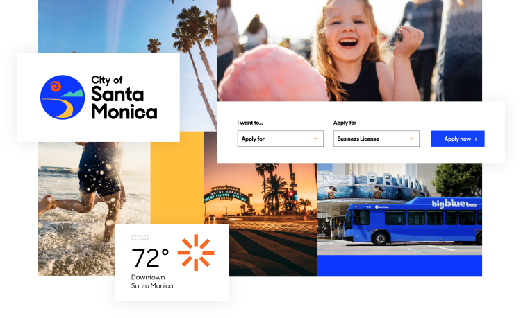
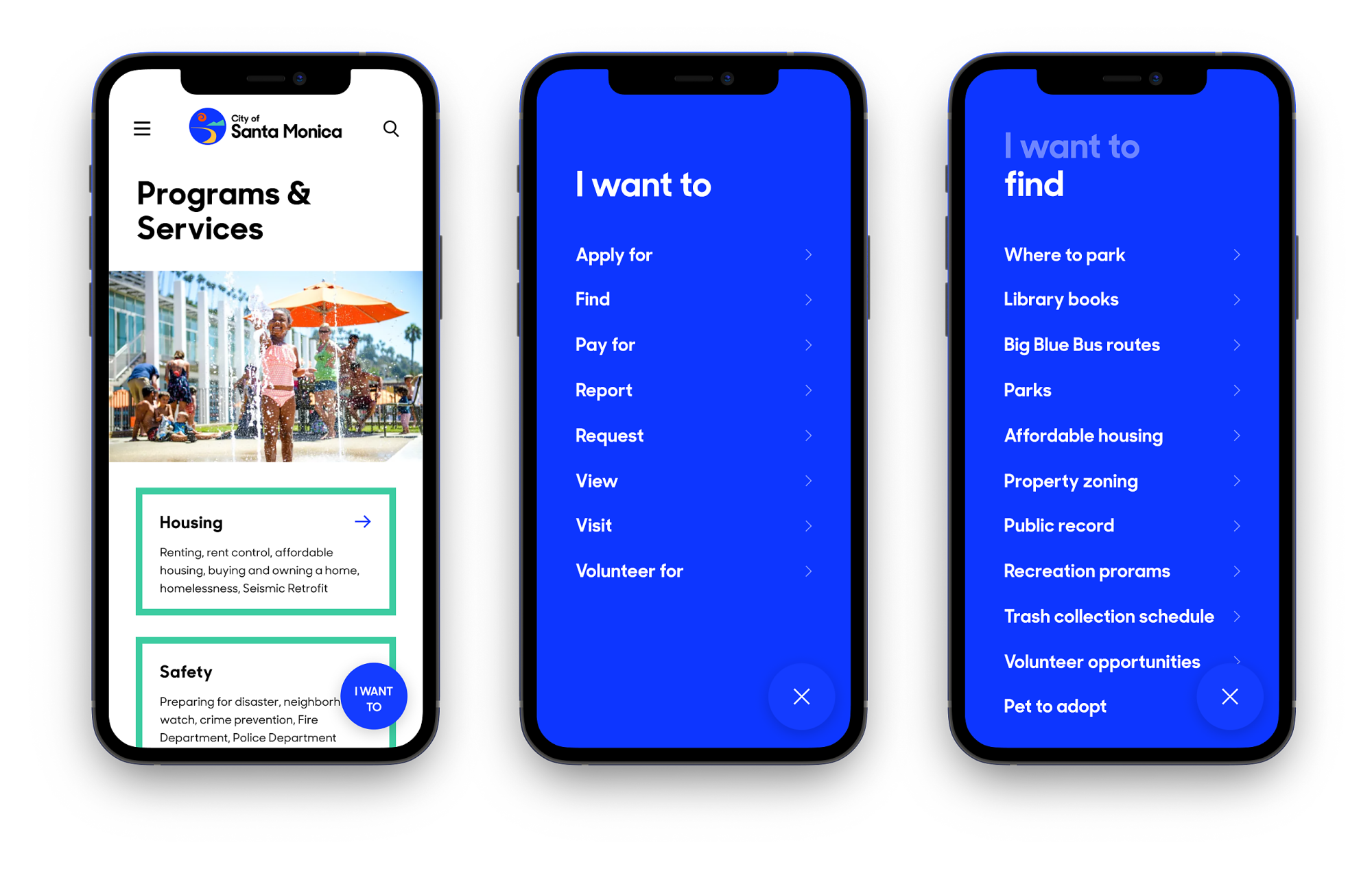
Using service design methodologies and user insights, we created a user experience concept that was a one-stop portal for the needs of constituents, the business community and visitors alike. Rather than organizing the site by the city department we rethought the entire content strategy to organize content by topic.


Brand strategy and identity
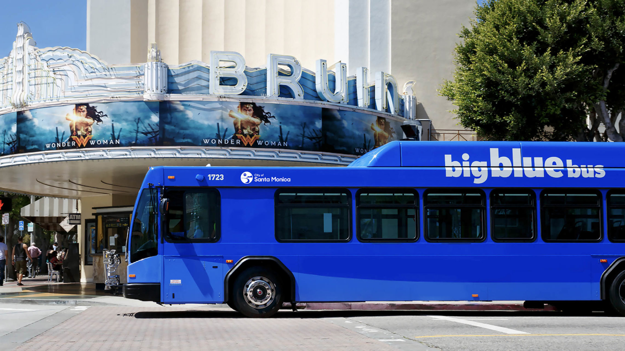
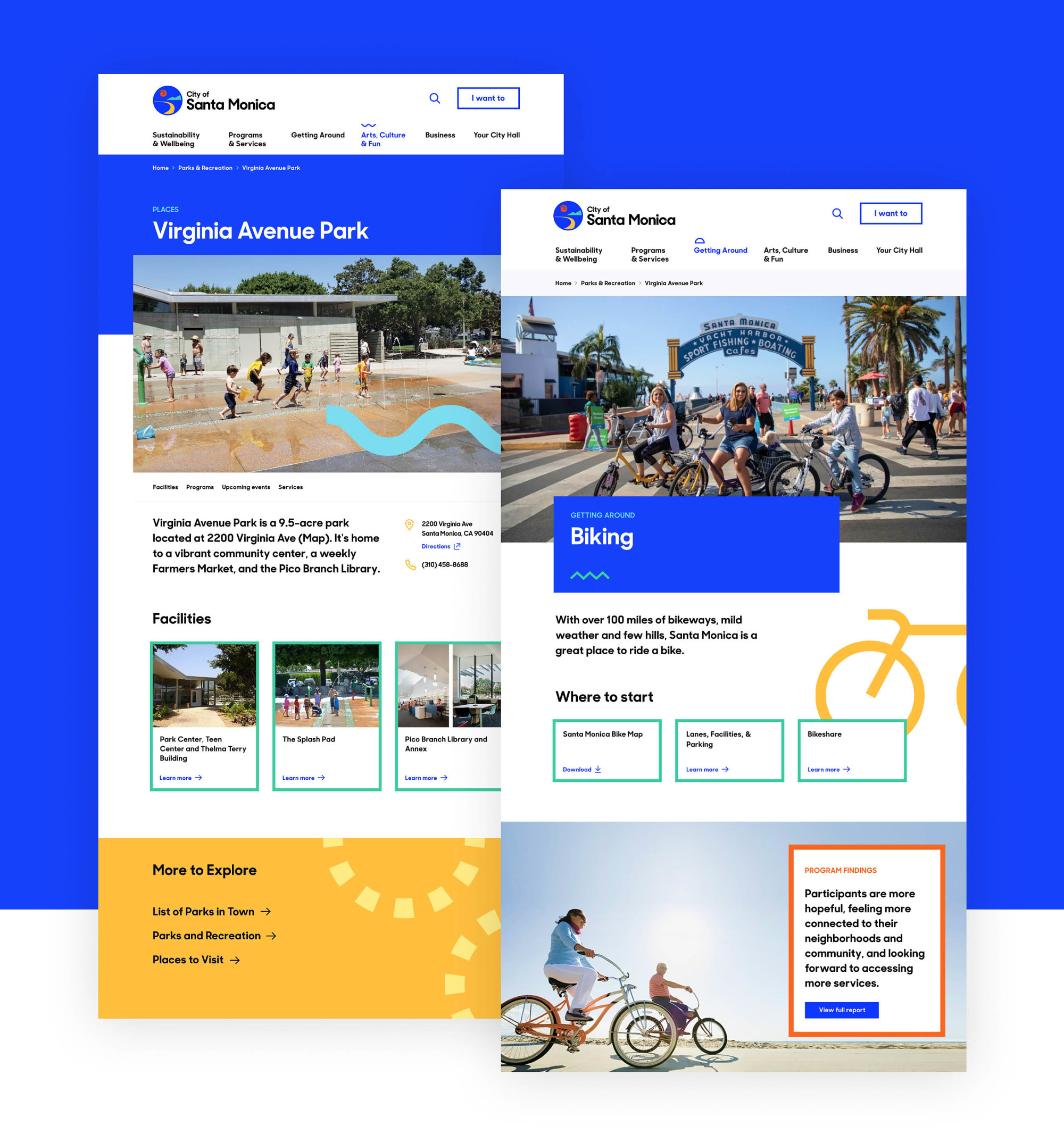
In order to create clarity and increase the impact of communication messaging, we focused our brand on a known asset: An umbrella brand that evokes positive emotions, authority and familiarity. The result: A unified brand architecture that is instantly recognizable and easy to implement.
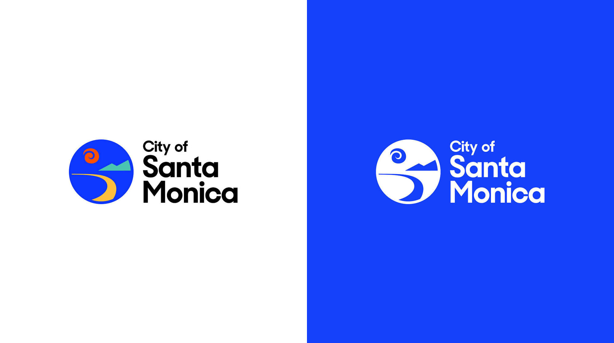
With roots in the official seal, the “bay” mark had visual equity that was instantly recognizable as Santa Monica. The new mark evolves the symbol to reflect the core brand values of the City while retaining the nostalgia and charm of the original.
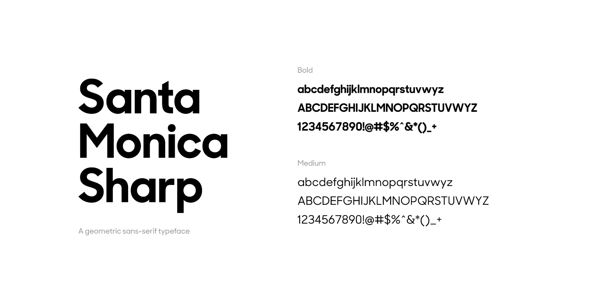
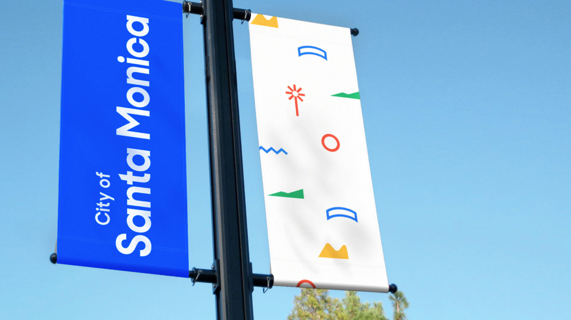
To modernize the overall identity, we created a new supporting palette that captures the vibrance and endless energy of the City by using a palette of shapes and colors inspired by the surroundings. Combined with the new user experience concept, a custom font, and restructured architecture, the end result is one that fully reflects user expectations of a 21st century city.
