Taking scientists to the next level
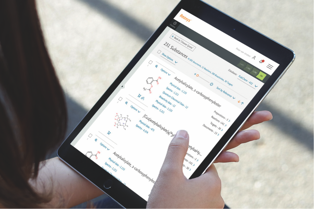
Elsevier, a global information analytics and technology company, helps institutions and professionals progress science, advance healthcare and improve performance. One of their most valued information products is Reaxys. The world’s leading digital tool for pharmaceutical and chemical R&D, Reaxys helps medical chemists to develop new medicines that improve the quality of our lives.

In the complex, expensive and lengthy process of pharmaceutical development it’s crucial that information can be found quickly and efficiently. Shortening the time taken to get medicines to market can save both lives and money. Elsevier asked us to help develop a new version of their digital tool, making it more intuitive, better, faster and more fun— and giving it an even higher NPS (Net Promoter Score).
Reinventing world’s leading digital tool for medical science
As always, our approach started by getting to know the target group. Especially working with such a specialized and international target group requires close cooperation with the client and an open and empathetic mind—which allow us to dive into a whole new world and make things that leave all of us thinking, wow, why haven’t we done this before?
During our extensive qualitative design research (the driving force behind the whole design process) we interviewed around 50 people, both on site and remote, and carried out usability tests to measure the efficiency, effectiveness, and user satisfaction of the old and new Reaxys—and to understand what would improve these measurements.
The most important findings were that users had to cope with information overload, and that the interface wasn’t future proof (neither mobile friendly nor using the latest technology). From here we developed our aim: to reenvision Reaxys, creating a more intuitive and visually engaging experience by rejuvenating the overall design and developing a tool that’s expandable over time.
With a team made up of designers and developers from both our team and the client’s own in-house team (and working from different places around the world) we first launched a prototype in beta, providing a starting point for us to optimize. Our development team were on hand to provide guidance wherever needed, and daily virtual meetups kept the whole team connected. Everything was designed with the client’s in-house teams in mind, because, once our work is done, they’ll be the ones working with the code every day.
The fastest way from Q to A
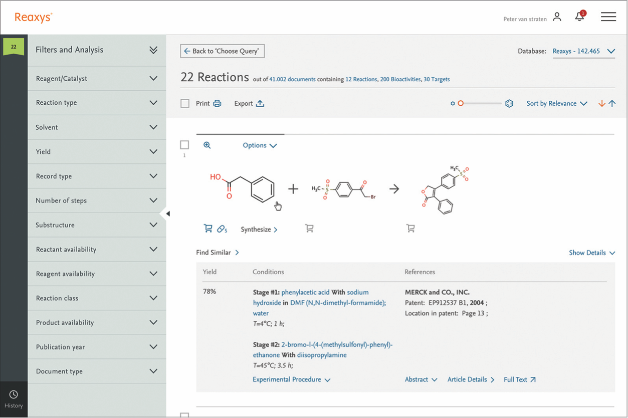
The result is a solid platform that offers a highly intuitive interface and robust database to help chemists retrieve relevant literature, precise compound properties, and chemical reactions twice as fast as any other solution on the market. Users rate the new tool much more positively than before. They think it’s more user-friendly (smoother and more streamlined) and it looks clearer and simpler. And it’s proven to deliver answers in half the time.
