A digital design refresh for the inventor of the car
With almost 100 years of innovation under its belt, Mercedes-Benz is a brand that needs no introduction. However, despite its rich legacy, the brand’s design language—now having to work across an increasingly digital customer journey—had become fragmented. Seeking to create a 360° design language refresh that would unify their brand and product experience, and for the first time ever bring together their marketing and in-car teams, they turned to Edenspiekermann.
The challenge: A fragmented brand experience
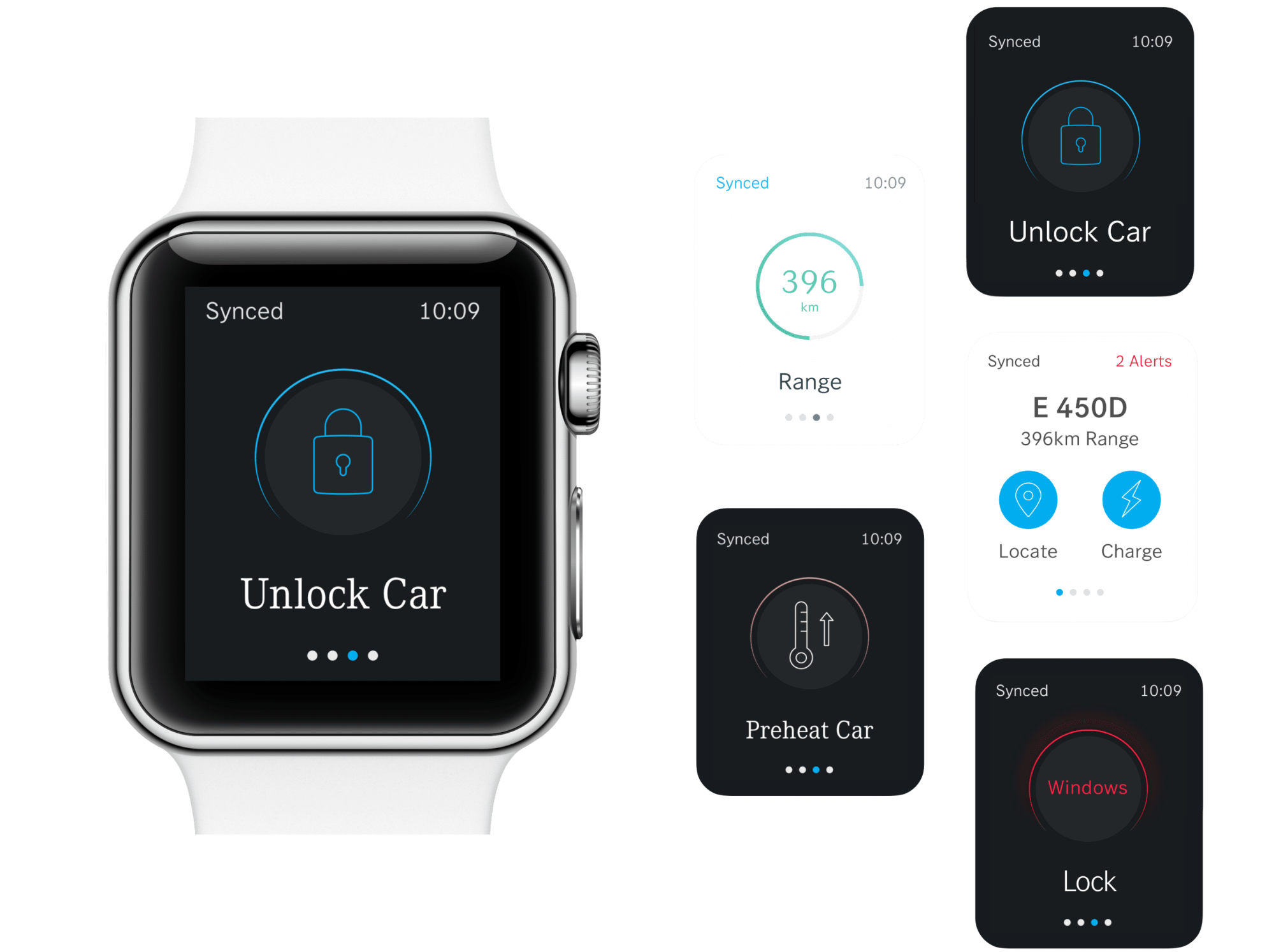
The rise of increasingly digital user journeys has made cohesive brand experiences more important than ever. A brand needs to feel equally consistent at the smallest touchpoint—such as a push notification on a smart watch—as it does on a 100ft billboard campaign. When it comes to a highly-premium automotive brand like Mercedes, the need for this seamless experience is even more paramount.
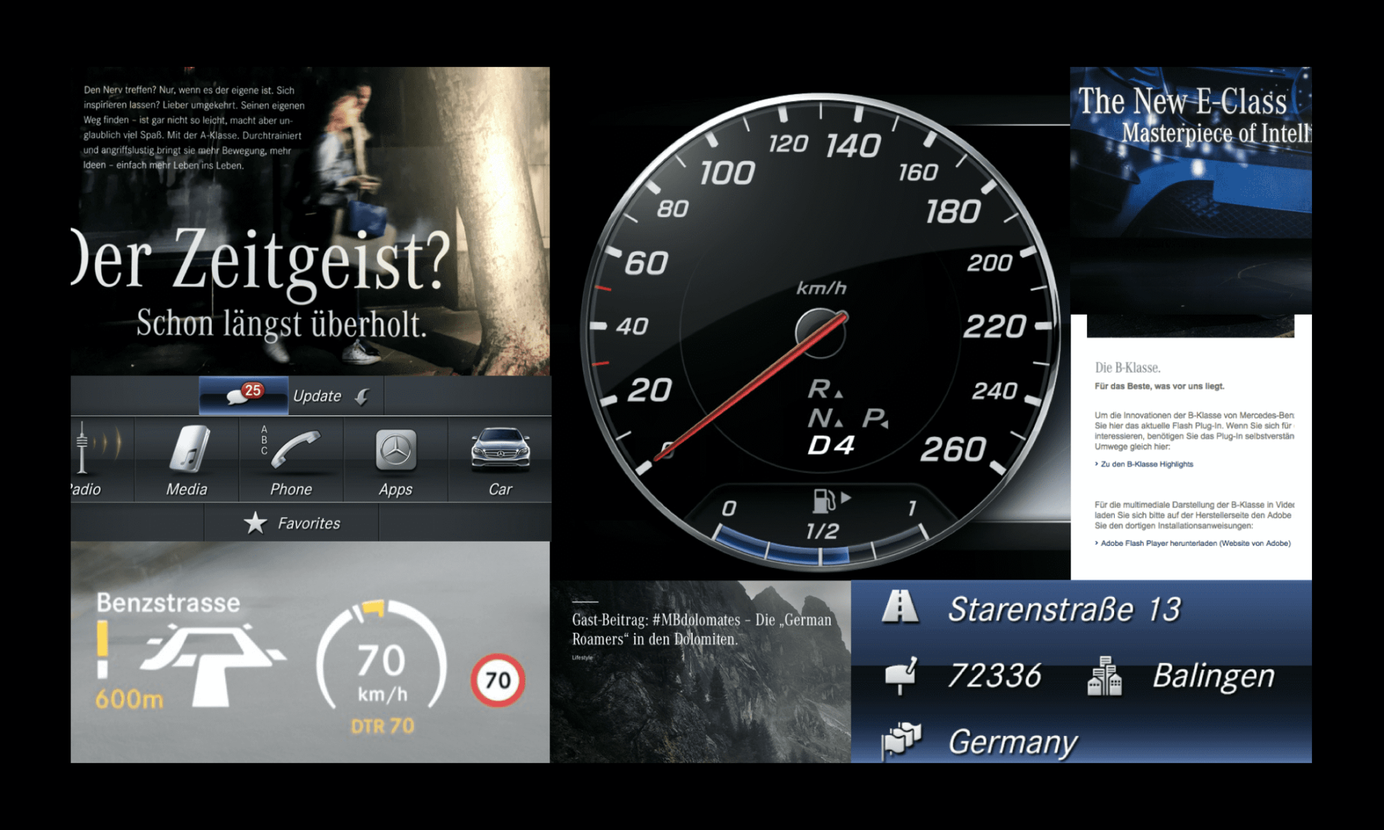
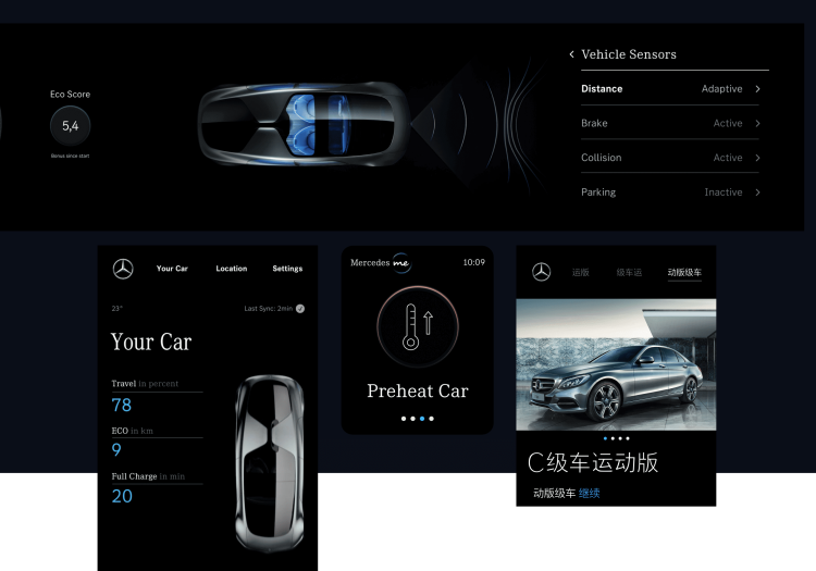
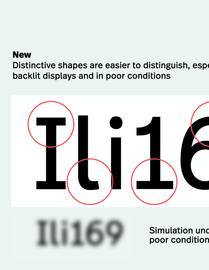
Designing for automotive comes with considerable functional must-haves that need to be considered. In the case of Mercedes-Benz, the existing typography did not meet today's requirements for digital brand experiences: Legibility on backlit displays, instant scannability and legibility in the car and across a broad range of end-devices of their customers.
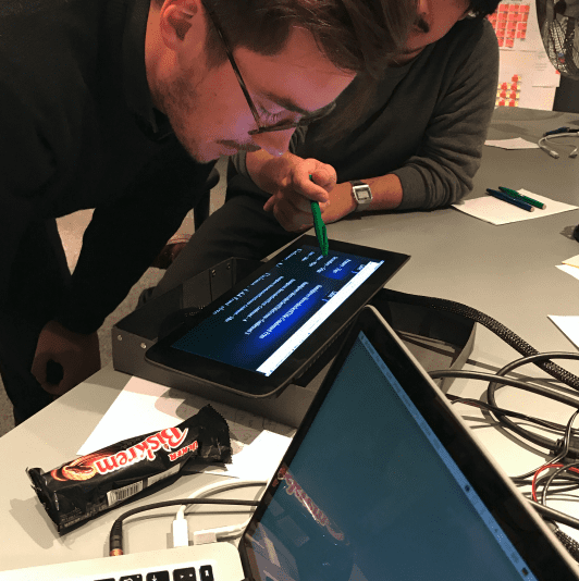
Our first step in the process was to bring together the marketing and product teams to align on how we could create a language that would transcend all departments. The goal was to align on the guiding principles against which all future design decisions—from the smallest typographic detail to the look and feel of an interface—would be assessed.
A modern brand language, inspired by heritage
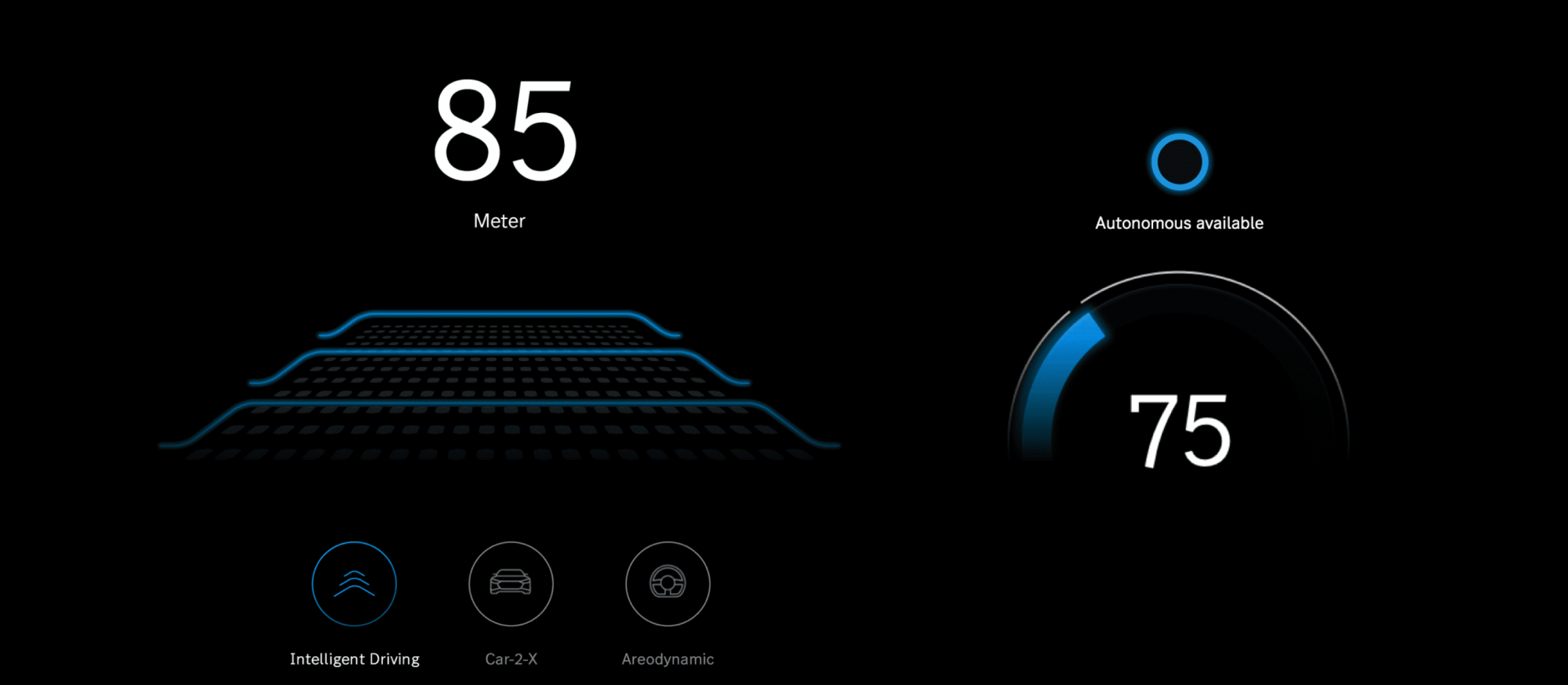
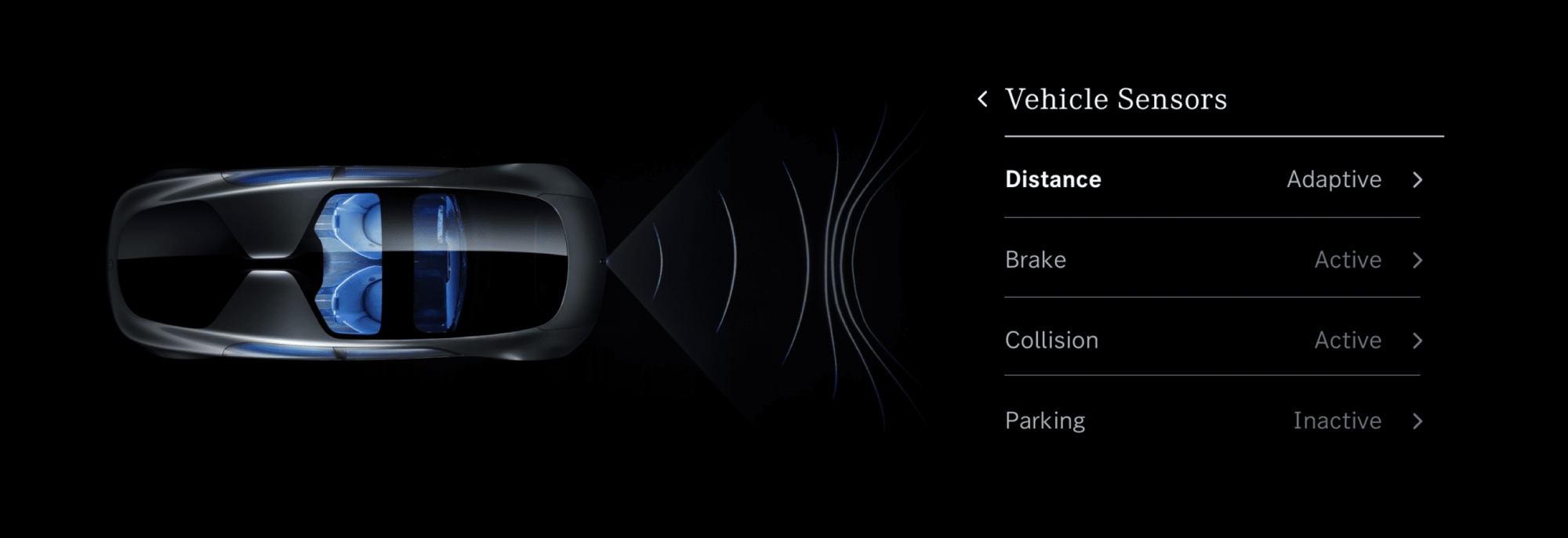
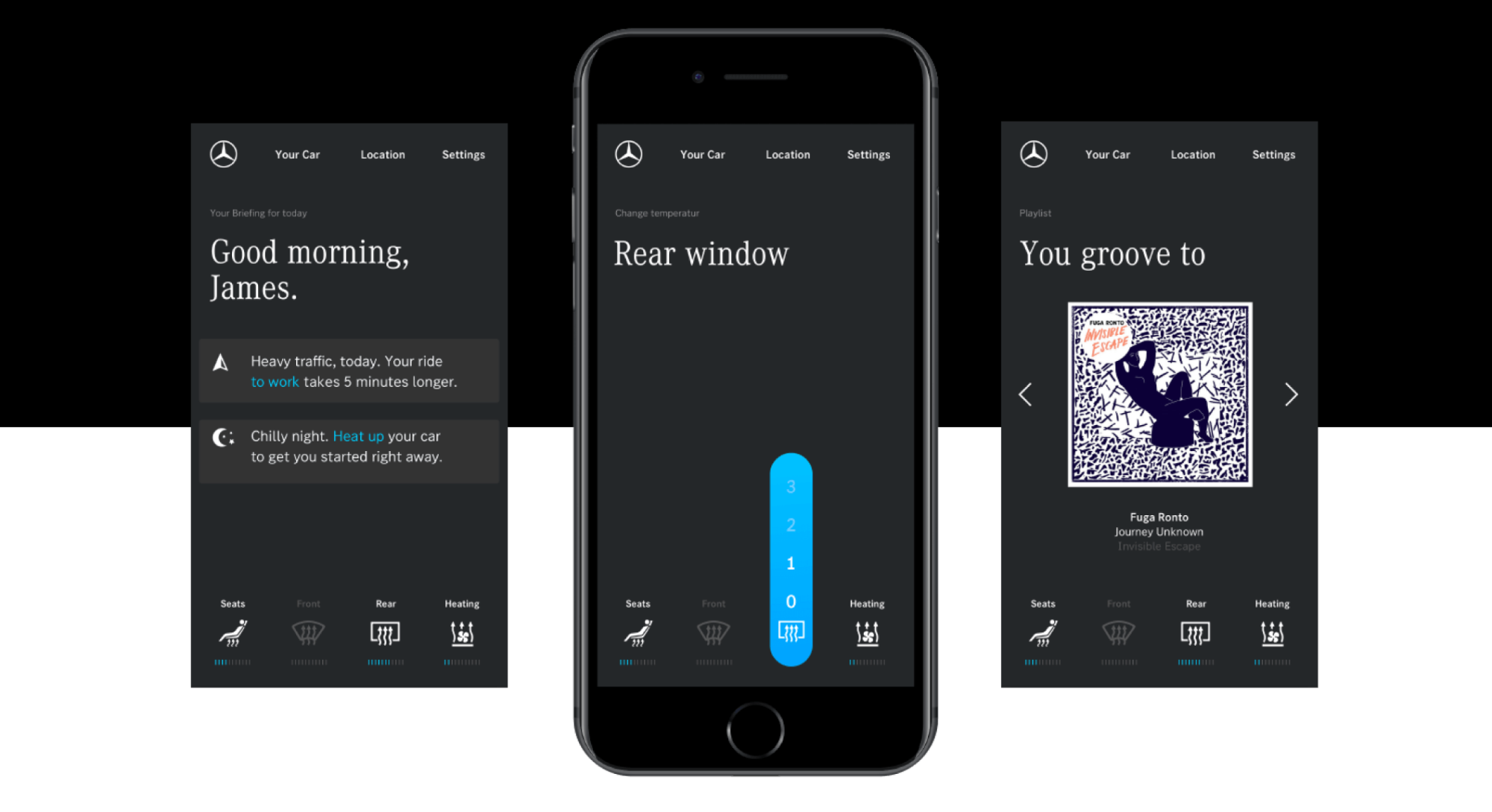
Together with the Mercedes-Benz in-house team, we developed a cohesive design language comprising an extensive family of custom fonts, and exploring concepts for a bespoke iconography. The joint project unlocked new expressive possibilities while celebrating the car’s original inventor’s heritage.
Refreshing a design icon
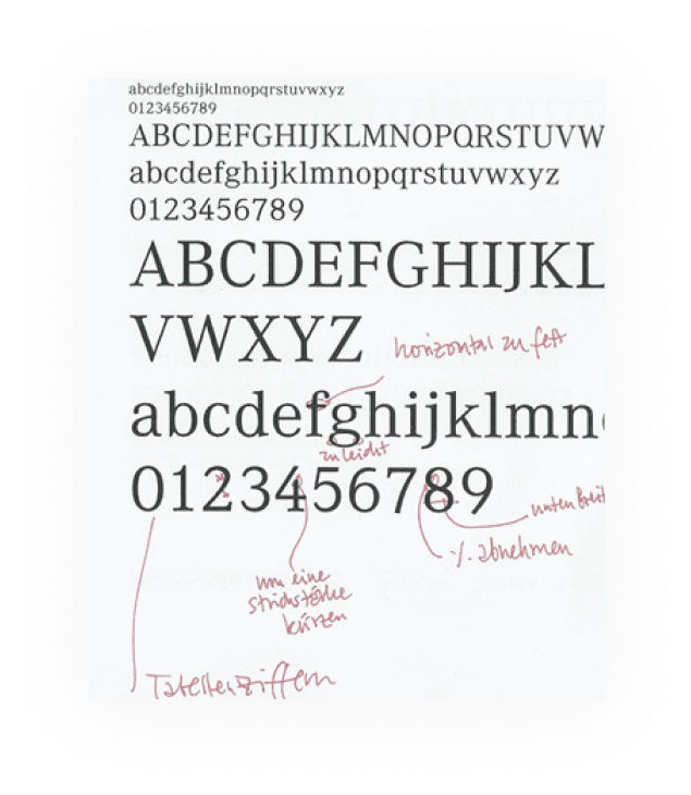
What made Mercedes-Benz’ design language instantly recognizable more than anything else is their custom typeface developed back in 1991. However, this main ingredient was not suitable to work in modern digital cockpits and applications. Our task: Explore options to align this with the requirements of the digital and global future, eventually giving this design icon a complete refresh.
The typeface family contains up to 39 styles to allow for drastically improved legibility while saving space in demanding environments like using your digital cockpit while driving. From the smallest screen on your wrist to augmented reality head-up displays, mobile applications on your phone to spatial signage and beyond, our work enabled the brand to be understood in over 200 languages spanning some 188 countries including a custom version of Thai.
- latin
- thai
- chinese
- Serif
- Sans
- Title
- Text
- Cond
- Reg
The world’s first Chinese condensed typeface
China has been Mercedes-Benz’s largest sales market since 2015 and its rapid growth continues. During the development of the custom typeface, we designed the world’s first Chinese condensed typeface seamlessly matching with its Latin alphabet. This is a crucial factor in the success of the typeface, because in most Hanji communication the model nomenclature is still cited in latin.
The perfect companion
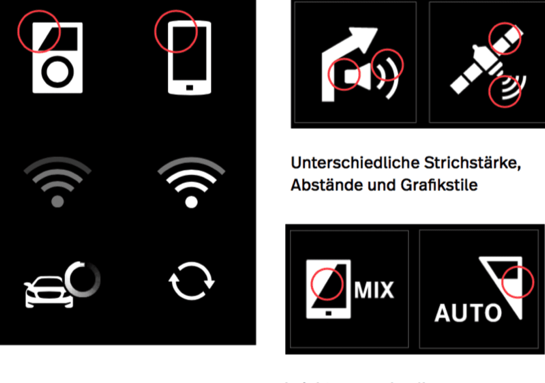
Building on a grid established by the new typography, we created a concept for how iconography could pair with it. Our concept: A custom suite of responsive iconography that conveys the unmistakable character of Mercedes at even the smallest of sizes.

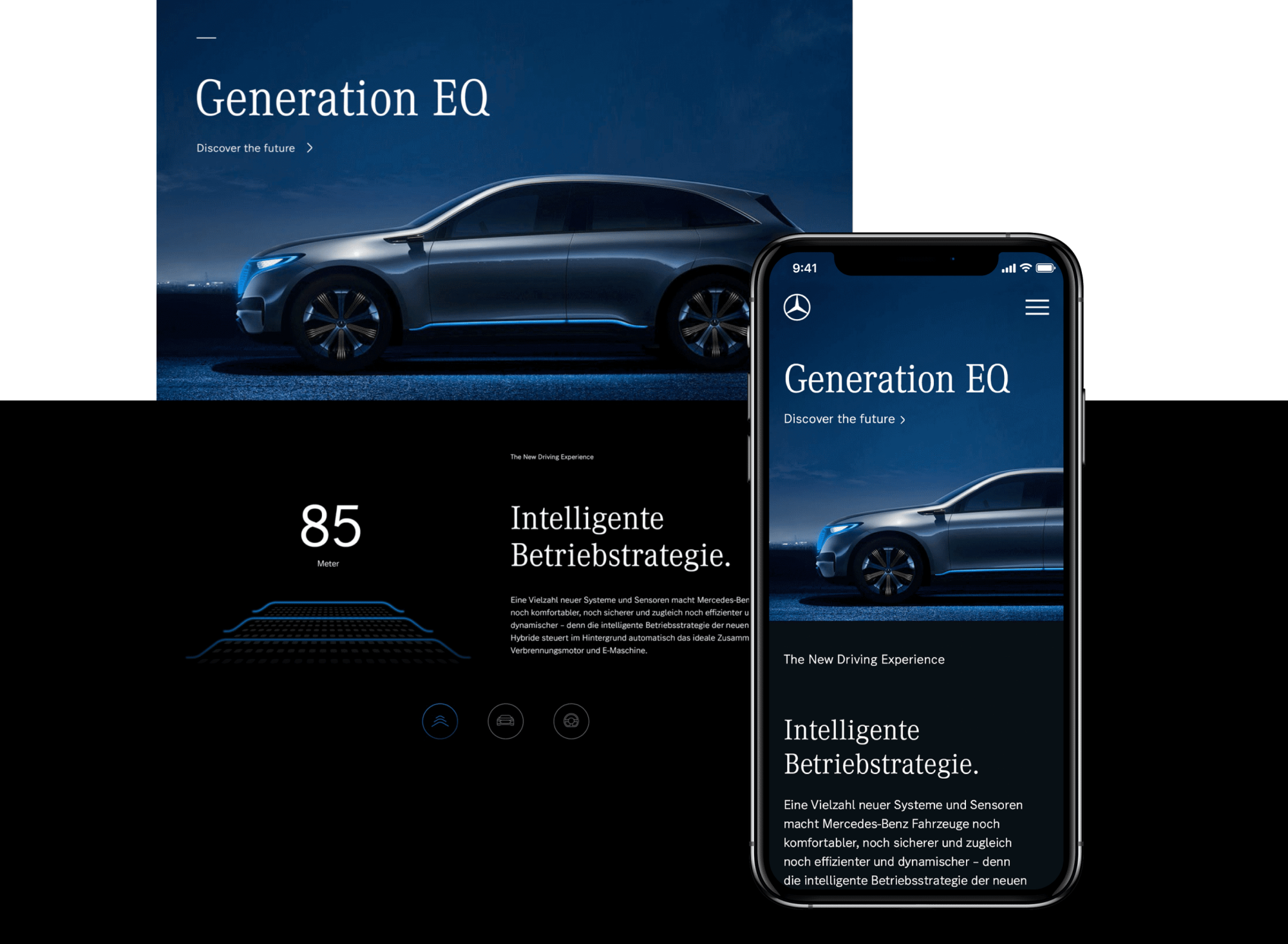
The world debut
With its launch of the all-new 2021 Mercedes-Benz S-Class the new typeface family is making its world debut. Matching the S-Class’ tagline “Luxury reaches a new milestone” the interfaces for the drivers and all passengers will witness the icon’s next evolution.
