Article
Bringing the Kröller-Müller logo to life using web technology

Last week I was pleasantly surprised by a direct message via Twitter from our former colleague Nils Hendriks, now working as an independent web developer in Tokyo, Japan. He wrote to me: “Hey! Are you ok with me using your animated gif logo in this proof of concept?” – with a link to a web address. Well, that got me triggered of course! The web page turned out to be a proof of concept for animated versions of the three-dimensional logo and typeface we developed for the Kröller-Müller Museum. Using only html and css, no images – click to take a look!
 http://poc.nirusu.me/km/
Our version of the logo, created in Cinema 4D and Illustrator …
 http://poc.nirusu.me/km/
and rebuilt using web technology. Click the images for the animated version.
I asked him a few questions to get a bit of background on this flattering initiative.
Why did you pick this visual identity for your project?
Nils: “I’m always looking for visuals created for different kinds of media to see how they would translate to the web with as little code as possible. I came across the Kröller-Müller visual identity before but lately I have been studying css transitions, transforms and keyframes animation and the two seemed a good match for a proof of concept.”
How did you approach this coding challenge?
Nils: “Without becoming too technical, I wanted to keep it as simple as possible. Just html and css, no Javascript. At first I tried to keep the html markup as minimal as possible, at least that was the goal. Browser differences (incomplete implementations of the spec, bugs) quickly proved that infeasible. The Proof of Concept now contains examples of both: with ideal markup and one with extra markup just for visual effects. Resources used vary from random blog posts I found to tutorials by websites like 24ways and Smashing Magazine. The goal was to try and recreate both the Kröller-Müller logo animation as well as the individual letters as shown on Edenspiekermann’s project page, with as little code as possible.”
Where do you go from here?
Nils: “I think trying to do this gave me a better insight in css features like transforms, keyframes animation and perspective. But you also realize right-away you’re only scratching the surface of what’s to come in the (near) future. Already there are people pushing the limits in these areas with things like css filters, shaders, Photoshop-like blend modes, Web GL and even web apps that create 3d shapes.”

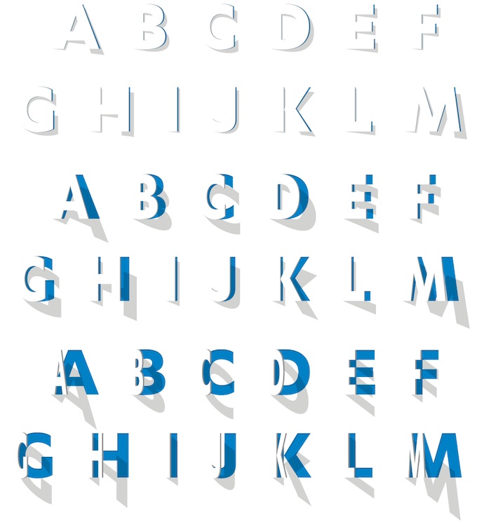
Our work for Kröller-Müller Museum: the custom made typeface opens up dynamically or in steps. Every version adds its own feel to the text.
If you’d like to learn more about Nils and his work:
http://nirusu.me
@nilshendriks