Article
“It’s not the logo”

Over the past 4 months we have worked on a major update of the visual identity of the City of Amsterdam. After the official approval by the Mayor and Aldermen of Amsterdam last week, the Dutch newspaper De Telegraaf posted a short blurb on their website about the logo update, also mentioning the cost involved. That post created quite a ripple on social media after which the traditional media also picked up on the story.
Here are some highlights of the media coverage. All of them in Dutch, I’m afraid:
- RTL4 EditieNL
- Parool.nl
- NOS.nl
- Nu.nl
- NRC Next (paid)
- Radio 2 (audio)
- Marketing Online
- Communicatie Online
To make it simple: we’ve created a completely renewed visual identity with new applications, tools, grids and guidelines, but we left the logo virtually unchanged.
Here are some of the applications we found last September when we started the project:
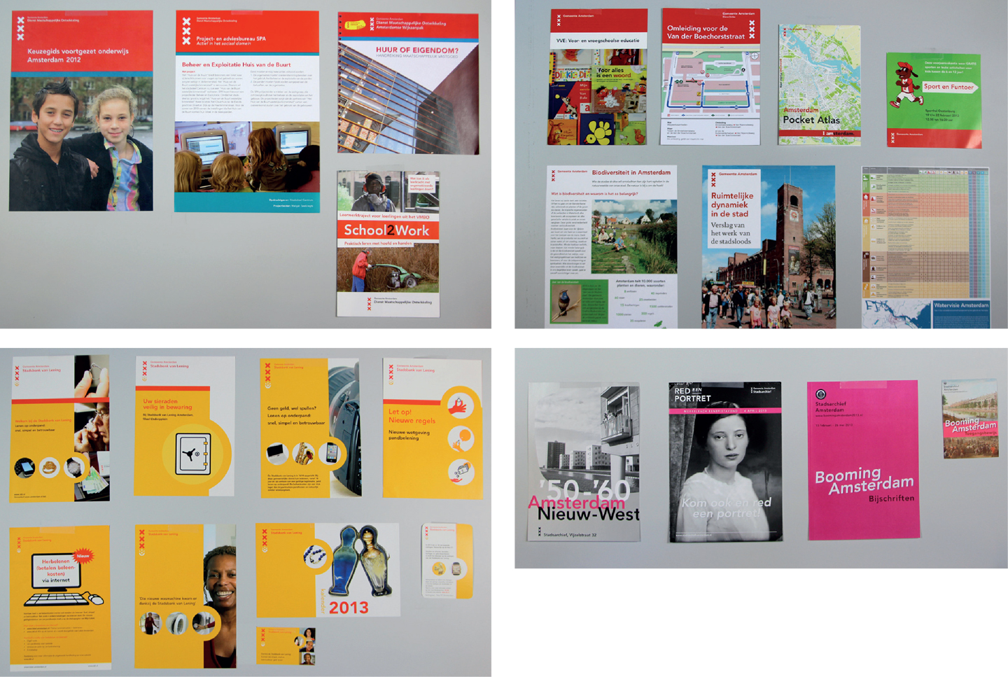
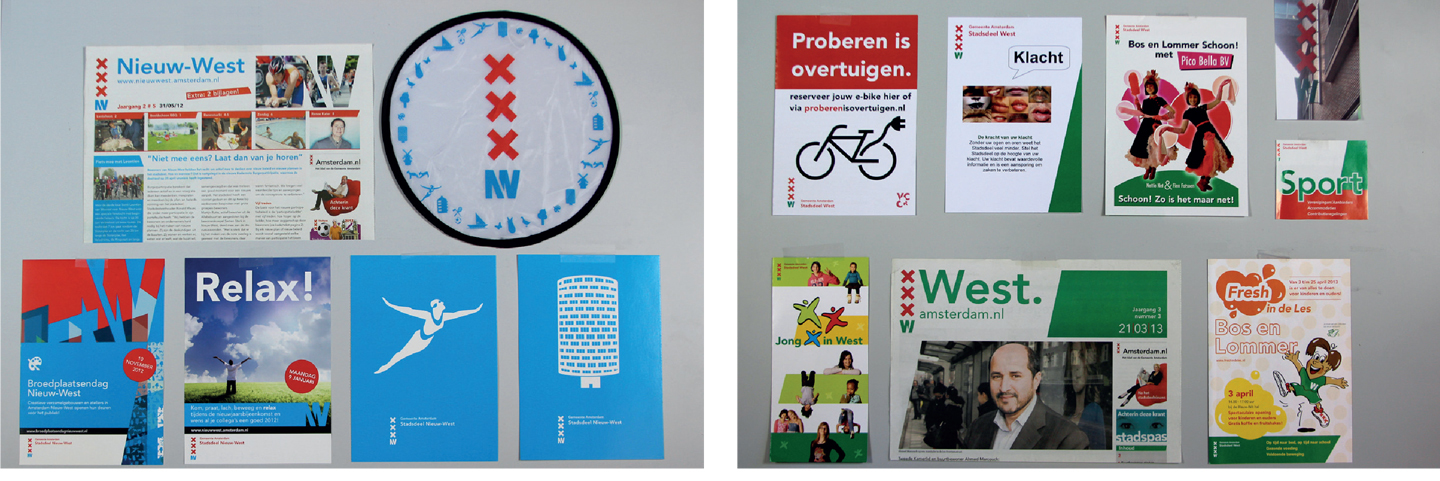
System of logos
The City of Amsterdam didn’t have one single logo, but a system of logos comprising over 40 different variations. Here are some of these logos that will now disappear due to changes in the city’s organizational structure:
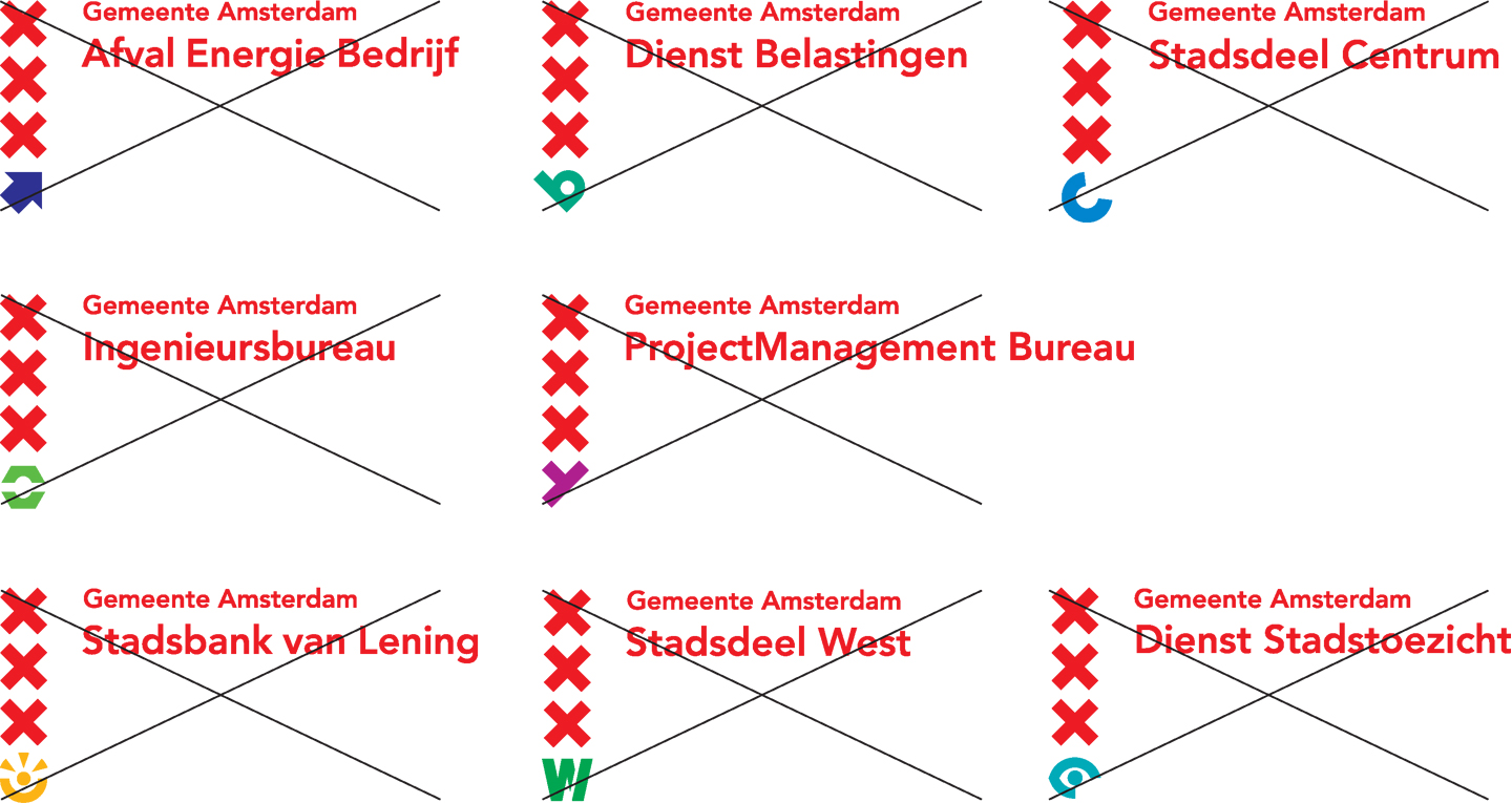
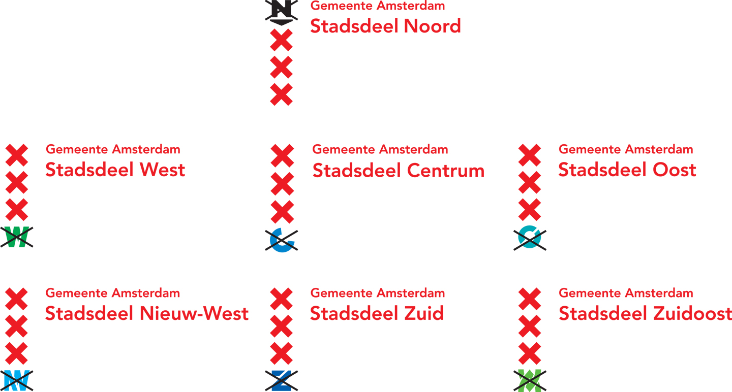
Starting in the Spring of 2014, the City will gradually move to this new, compact logo model:

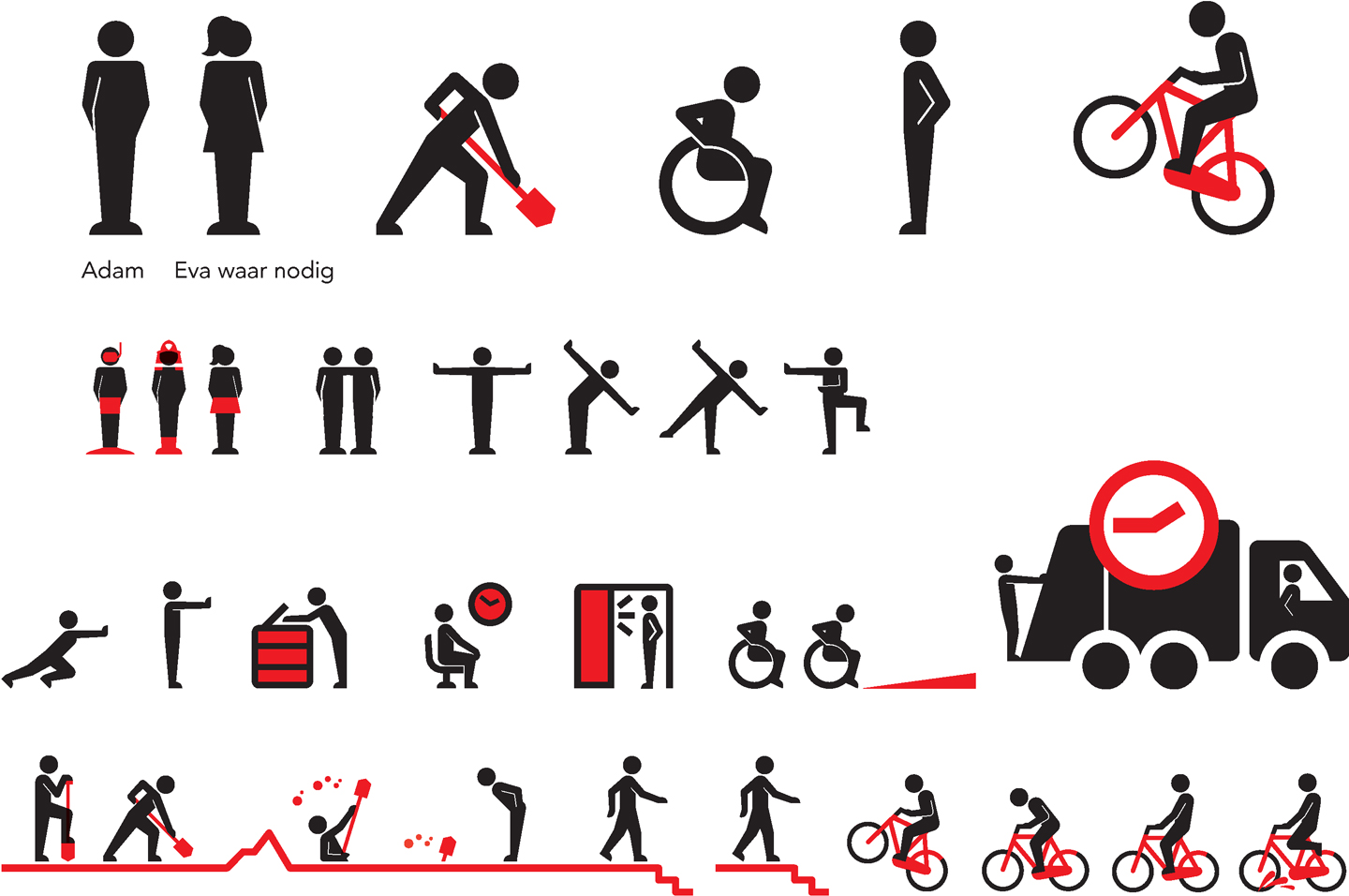
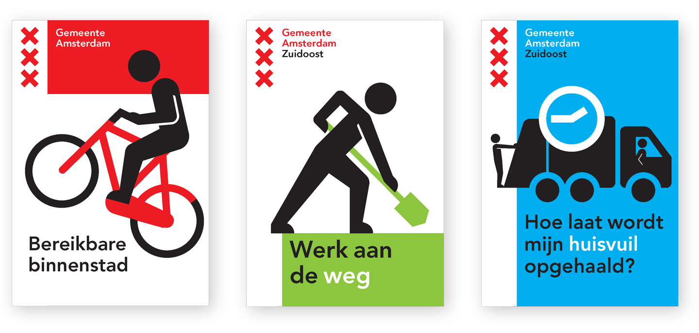
And here are some of the inspirational example applications which we developed over the past months.
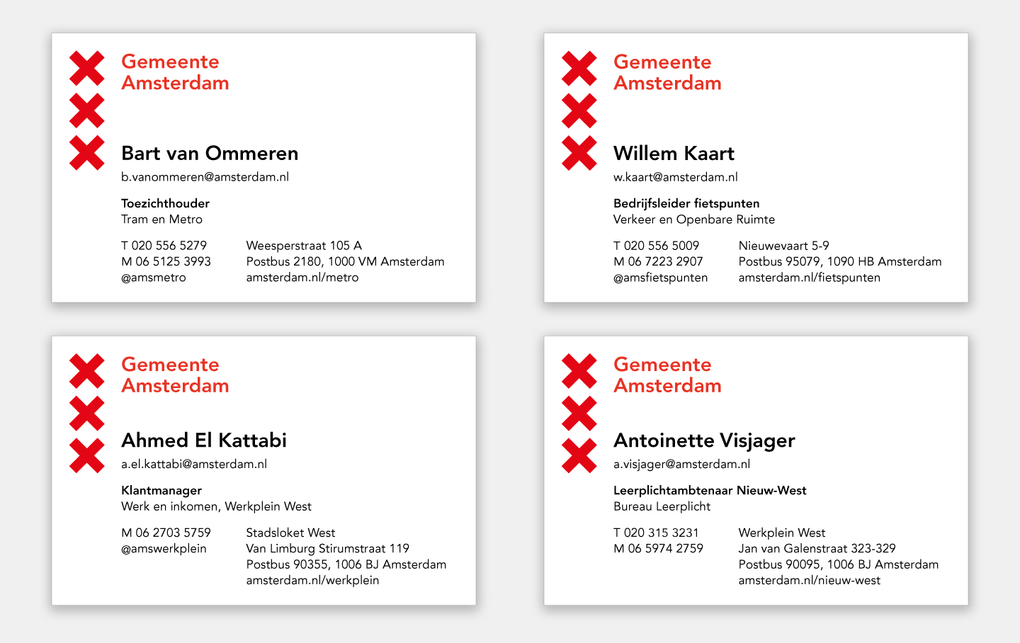
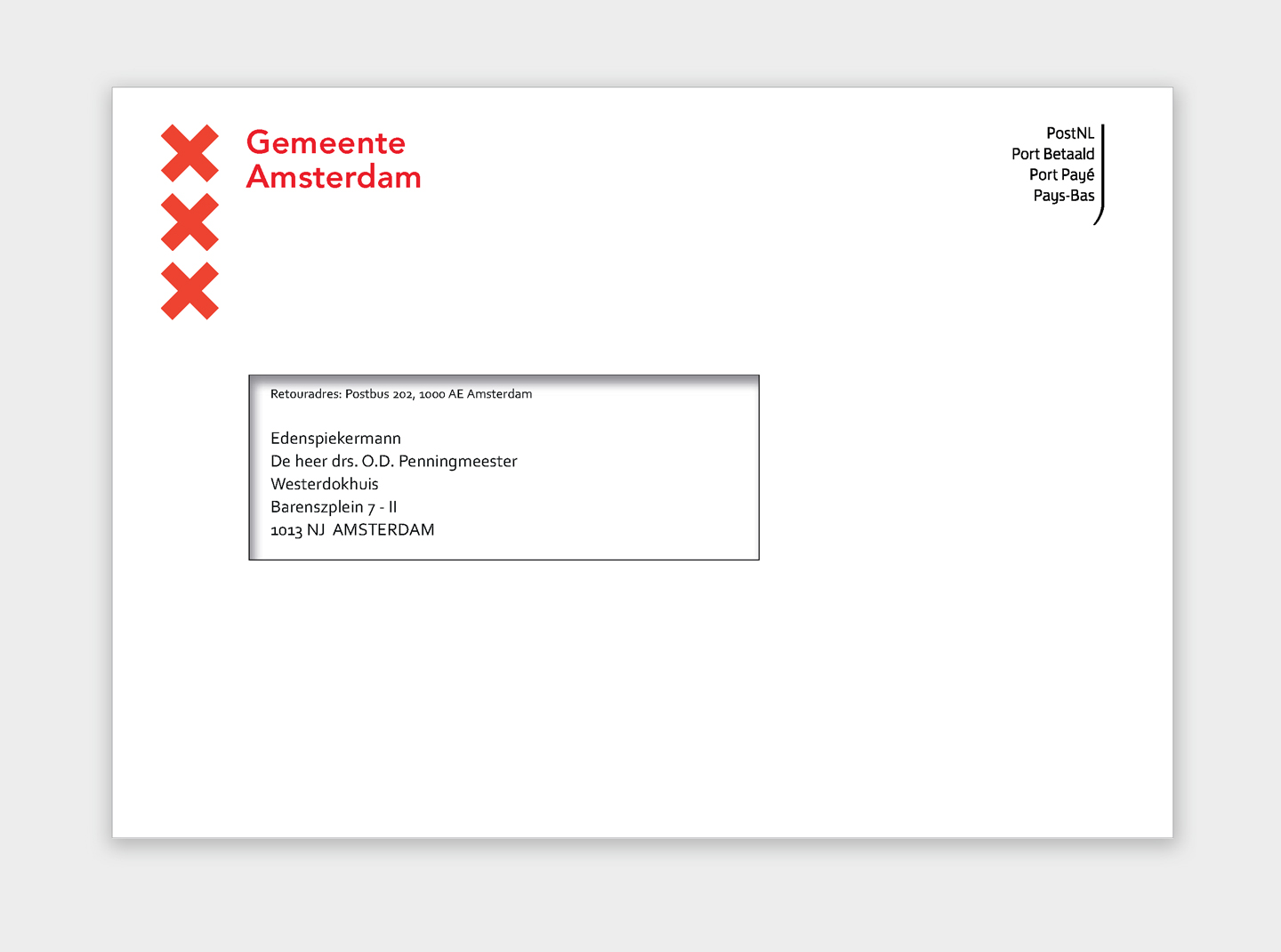
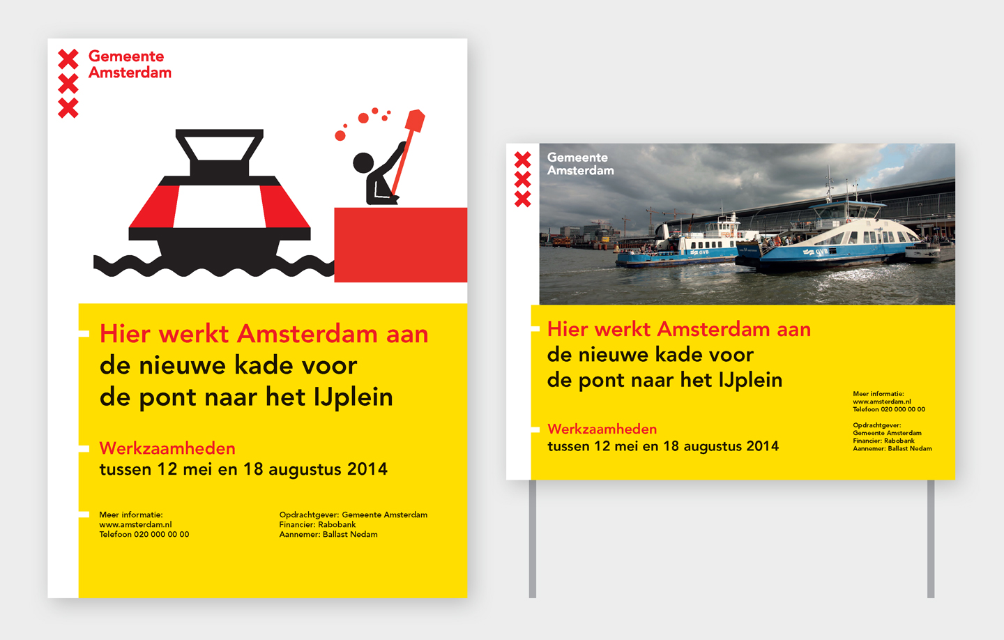
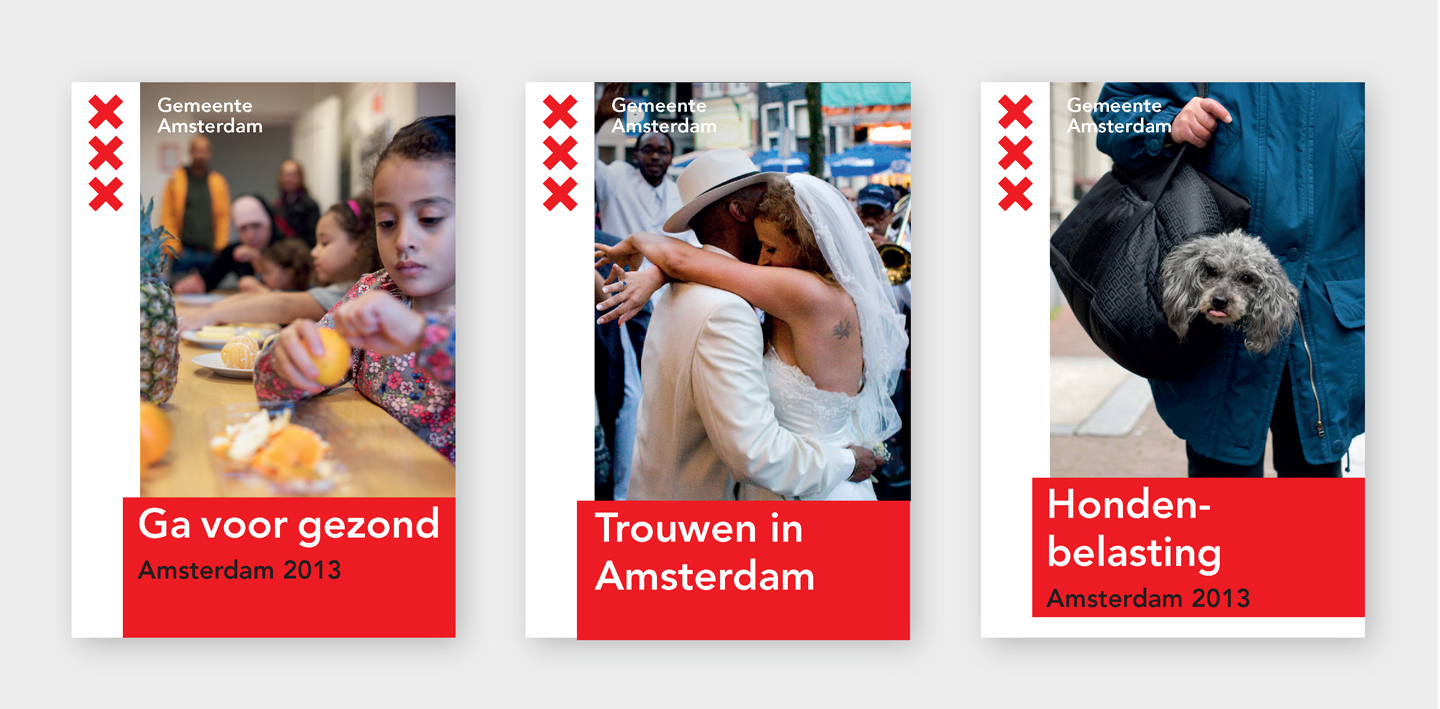
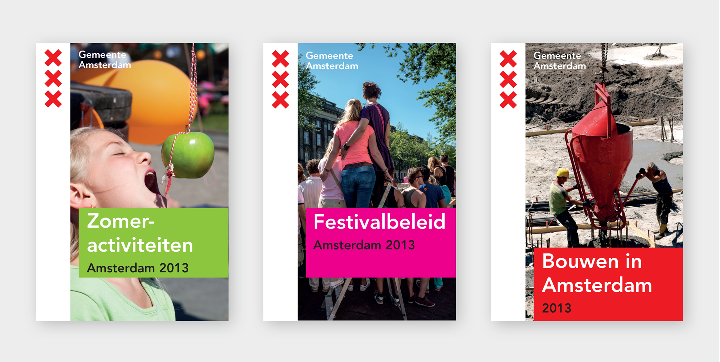
Photos © Edwin van Eis, Thomas Schlijper and Nationale Beeldbank
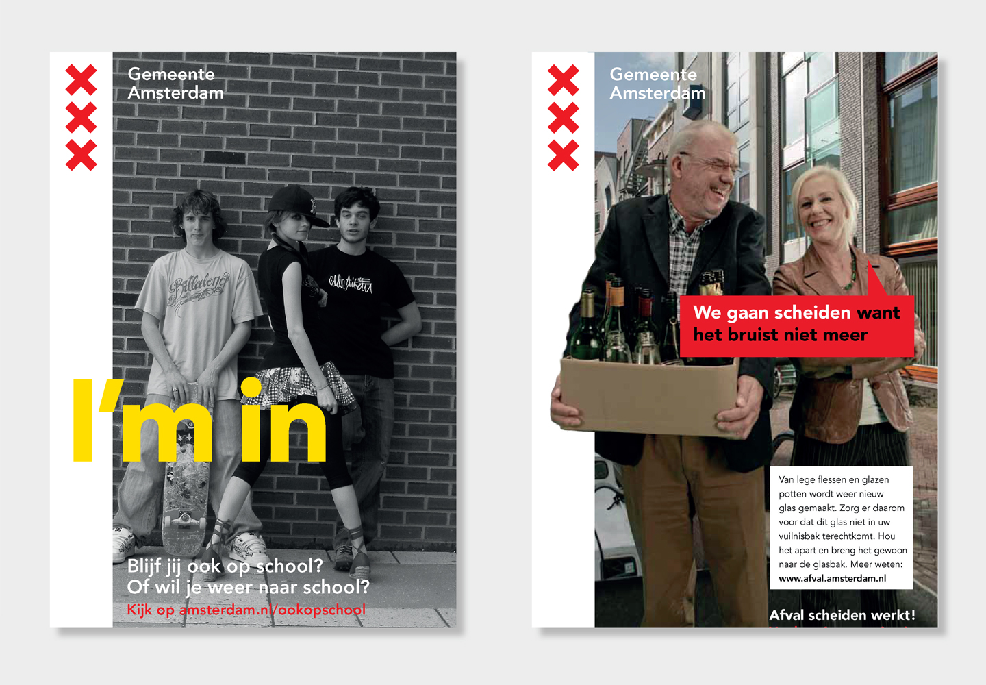
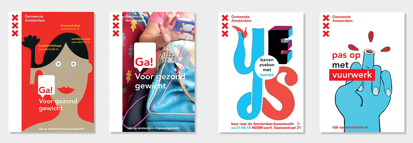
Illustrations © Stang and Piet Parra.
Creating efficiency
Hanane Lechkar, spokes person for the City of Amsterdam about the efficiency of this change:
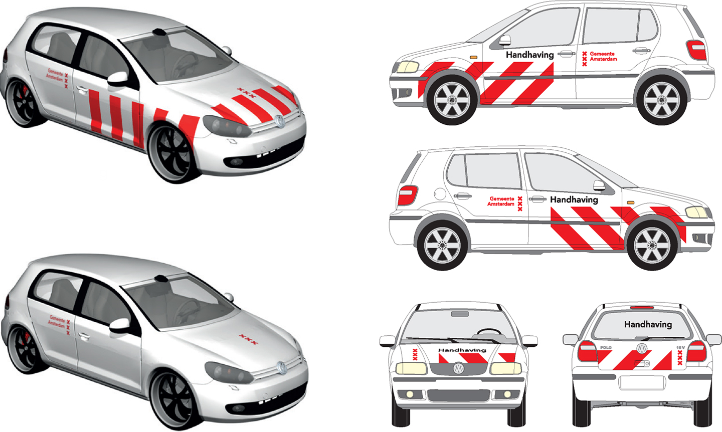
“Among other things we’re going from 250 different types of envelopes to a maximum of 25 types of envelopes, to one unified letterhead and to one type of fleet marking. By doing this we can purchase items in larger quantities which makes them cheaper in the long run.”
More about the identity change on Stijlweb Amsterdam (in Dutch)
Update (February 13, 2014)
After the initial attention in the Dutch press, our work for Amsterdam got picked up abroad as well, but mainly in design blogs making the ongoing discussion about this project maybe less interesting for many, but more substantial for some others. Here are some highlights.
We worked on this project together with the design agency Thonik. We were also jointly responsible for the city wide identity system which was introduced in 2003 and won various accolades in the Netherlands and abroad for being a ground breaking brand identity for a municipal organisation.