Article
Live, work and play in Amsterdam


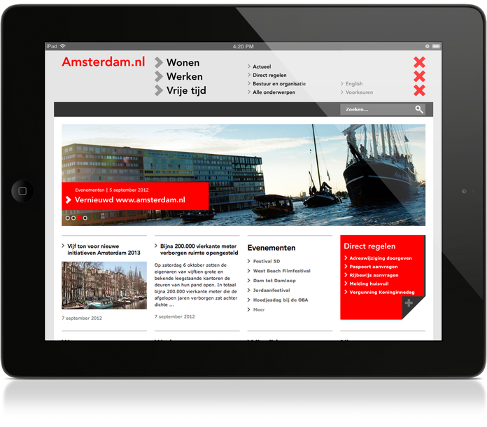
The Style of Amsterdam, the identity of the city of Amsterdam is about ten years old now. Ten internet years is like an eternity; technologies came and went, the mobile internet and social media jumped into our daily routines. Nowadays the municipality has a huge web presence, consisting of many bigger and smaller sites. When the City of Amsterdam wanted to consolidate most of their web presence into a single site we knew we had to rethink the navigation and information structure. Many municipal sites have opted for a target group driven navigation with residents, businesses and visitors as the primary entrances. We however preferred an approach in which content is grouped into three big themes of life: Working, Living and Playing. The themes refer to the target groups as mentioned before, but are less strict. The theme 'Working' could contain content relevant for residents and commuters (traffic information), job seekers (careers at the municipality) and business (subsidies, taxes and fees). Each theme has its own landing page including an extensive set of topical menus with ample headroom to allow further growth. Usability tests confirmed this direction to be an intuitive and a comfortable navigational design.
The updated interface has a responsive layout. A web optimised version of Avenir, Amsterdam's primary typeface, is used for primary headings and navigation. Amsterdam.nl has been soft launched on September 6th (only in Dutch). In the coming weeks rough patches will be smoothed and a growing streams of pages will show the new design.