Article
Open sesame

In the past months our work for the Kröller-Müller Museum got a lot of attention in blogs and social media, especially outside of the Netherlands. Apparently, we’ve created something fresh that resonates, at least within our own peer group.

Jeroen Disch, creative strategist at Edenspiekermann, about our source of inspiration:
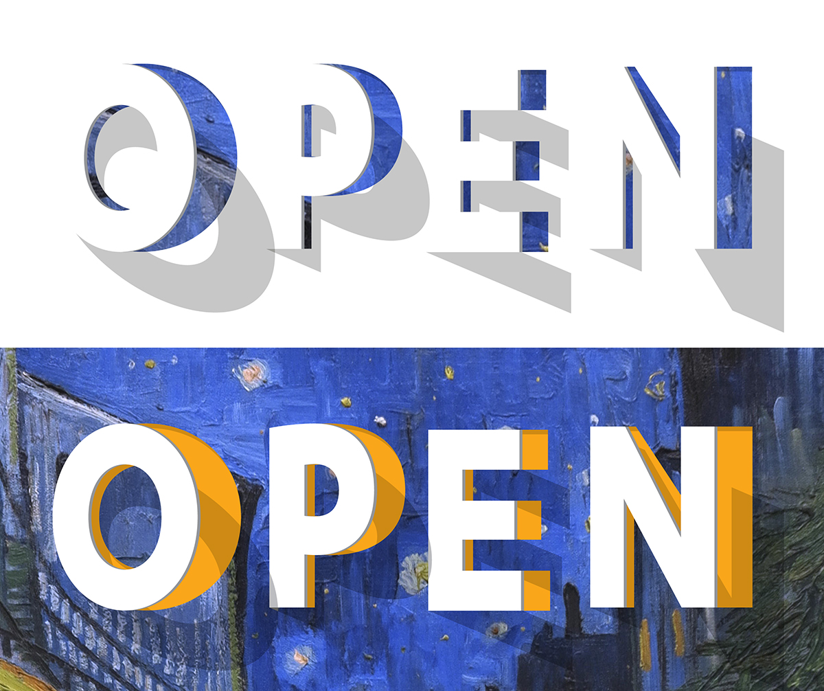
“When we started this project we were struck by how much the Kröller-Müller Museum has to offer besides its art. The environment plays an important role in the visiting experience. The museum is located in a beautiful, green park and its huge windows really draw the surrounding nature inside. Outside, in the sculpture garden, you'll find a large part of the art collection. So, depending on the weather and season, and depending on whether you look from the outside in or from the inside out, the museum is always different. This interplay between art, architecture and nature was our starting point for the identity. Influenced by light, shadows and movement the letter shapes become sculptural typography which can be subtly animated.”
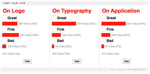
The most interesting review was this one. Don’t forget to read the comments below the post!
Kröller-Müller identity on Brand New

Find some more coverage of the Kröller-Müller identity here:
Kröller-Müller identity on Fast Company's Co.Design
Kröller-Müller identity on Type for You
Kröller-Müller identity on Fonts in Use
Kröller-Müller identity on Corporate Identity Portal
And here’s our case study:
Kröller-Müller Museum