Article
Responsive JavaScript with minwidth.js and relocate.js

We have been using a mobile-first approach to responsive web design for quite a while now: This means using CSS media queries to create responsive layouts and JavaScript to deal with the more complex matter of responsive images. We also frequently noticed cases where we needed JavaScript functions to be called if the window is wider than a given width, because some things can not be solved with CSS. Being the perfectionists that we are, we wanted this to work when resizing the browser and also to be able to revert the change when the window becomes smaller again. One example is to move certain elements into a sidebar on wider windows or move the navigation from the footer into the header. Another example is asynchronously loading some JavaScript files in wide windows.
[readmore]Continue reading![/readmore]
relocate
So we came up with this function call:
var sidebarElements = document.getElementsByClassName("sidebarEl");
var sidebar = document.getElementById("sidebar");
// here is the function call:
relocate(600, sidebarElements, sidebar);
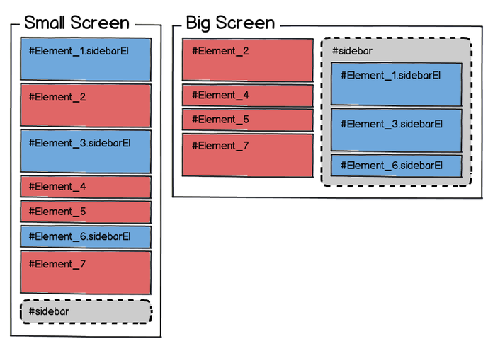
Now the sidebarElements can be mixed into the regular layout of the page on mobile devices and they are automatically relocated into the sidebar on screens wider than 600 pixels.
demo
Check out the demo to see it in action.
 HTML elements can be moved around on the page depending on the width of the screen.
minwidth
The relocate function is a special case of a function which is called when the browser window is or becomes wider than a minimum width. This is implemented in the minwidth function.
minwidth takes at least two parameters, the first one is the width, the second on is the function which is called when the window becomes wider than the given width or if it initially is wider than that. The third parameter is the function that is called when the screen becomes smaller than this width again, you can use this to undo the changes from the first function. The implementation of relocate looks something like this:
function relocate(width, elements, targetElement) {
  minwidth(width, moveElementsToTarget, moveElementsBack);
}
The minwidth function can be used in cases where a script needs to be loaded only on wide screens. Loading a script with the fantastic $script.js, which we use to asynchronously load more scripts, looks like this:
function loadFacebook() {
  $script("http//connect.facebook.net/en_US/all.js#xfbml=1");
};
minwidth(600, loadFacebook);
In the rare case, that you need to enhance the mobile experience, but not the desktop version you can pass in a fourth parameter and it will cause the the function to work in desktop-first fashion: It calls the second function if the window is initially smaller than the given width, but nothing if the screen is wider than that:
minwidth(480, null, enhanceMobile, true);
The source code for the minwidth and the relocate functions can be found on github.
Notes
- We decided to implement this without using jQuery or any other library, because we wanted to load those asynchronously later on, but at the same time wanted to relocate the elements in a synchronous script at the head of the page to avoid elements visibly jumping around.
- Because getElementsByClassName is not available in some browsers we support, we came up with our own little polyfill which combines the best approaches to this problem. If elements were only retrieved using getElementById, this would not be necessary.
- It's small: minified it's less than a kilobyte, gzipped even less.