Article
The 10 Foot Experience

How often do you watch shows on a TV set, using the TV’s own remote and interface? While TV shows have never been bigger, more varied, or more talked about, if you’re anything like me, you probably watch shows using your laptop or through apps on games consoles. The user experience is better, and the navigation faster and smoother.
For me, using my Playstation means I don’t have to deal with other interfaces, like the set top box that streams the TV signal. It isn’t great, and the remote control that came with it is pretty lousy too. Smart TVs also have their own built-in interfaces, but they tend to be cumbersome, slow, and cryptic. So how can we change this? Here at Edenspiekermann, it’s become something of a specialist subject.

We build a lot of digital products and services. In most cases we create websites or web apps—experiences that users navigate with keyboard and mouse, or touch screen. But recently we’ve been developing user interfaces for TV screens, building “10-foot experiences” that people use with their TV remote.
Last year Red Bull launched the new redbull.tv, which this week won “Best TV Experience” at the GooglePlay awards. We worked on this project for over 2 years, together with the Red Bull Media House in Santa Monica (and you can find out more about the project here). We also recently worked with a German TV channel to launch their new HBBTV offering, which is now available on TVs nationwide.
So what makes a great 10-foot experience?
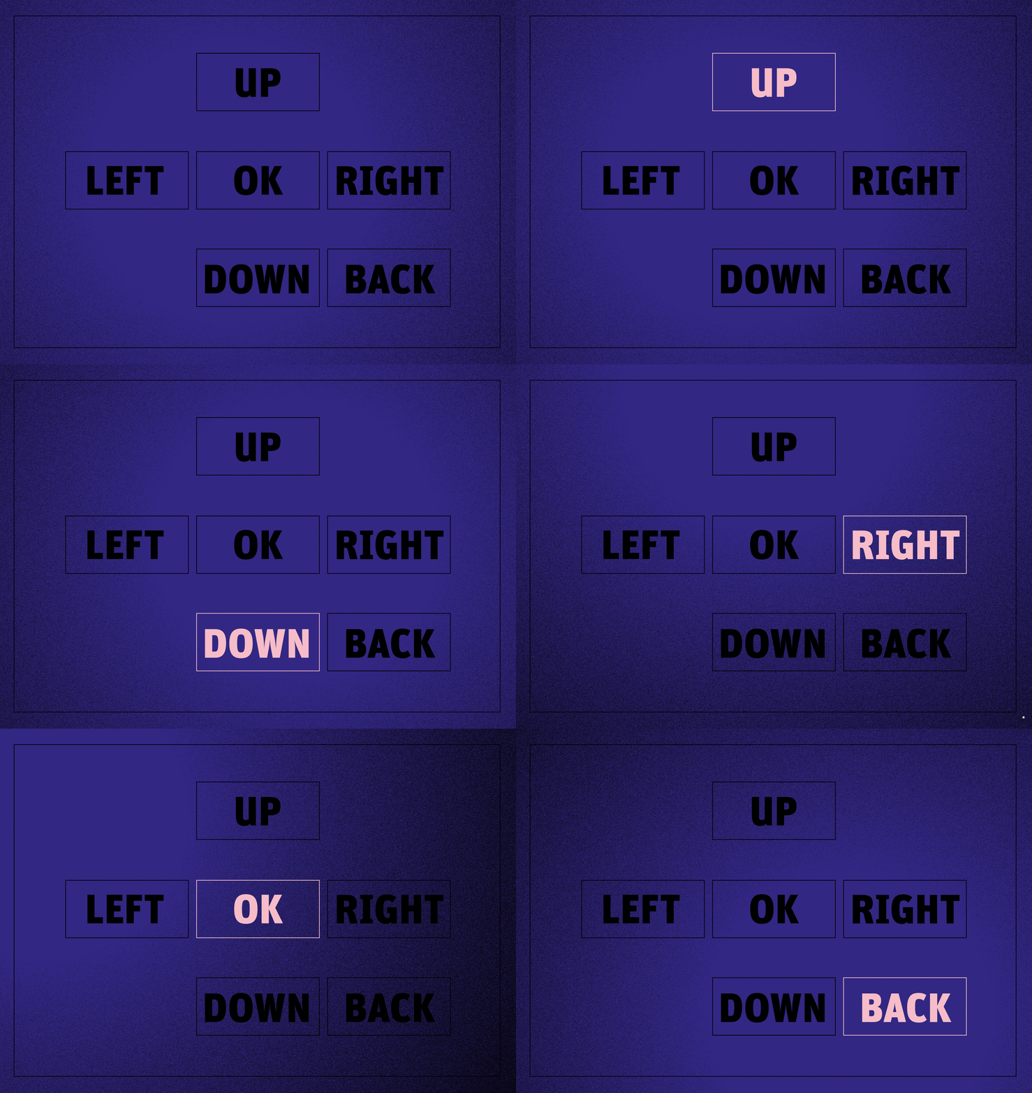
Every user interface should offer effortless navigation and control. For the 10-foot experience, this is twice as important; with only up, down, left, right, OK and back as your input vocabulary, things had better be crystal clear. You want to sit back and enjoy without having to look at your remote—your thumb should fly over the buttons to navigate, select, and activate.
 Here’s what we found to be the building blocks of a great 10-foot experience:
Focus
Focus is paramount. There’s no cursor and no mouse arrow on the screen. By pushing the directional buttons, the user just jumps from item to item, so navigating the interface means highlighting elements and bringing them in and out of focus. Make this focus as obvious as possible; try inverting colors, working with bold outlines, and making significant changes in size. Go big and bold—this is no time for subtlety. It might look clumsy on individual static screens, but it will feel elegant in the prototype. An unmissable focus will have you flying through items in a satisfying way, so make sure the focus is obvious on every screen—even to a passerby looking over the user’s shoulder.
Clarity
“Up and down”, “left and right”, and “OK and back” leave few options. The user navigates across the interface in straight horizontal and vertical movements, so always convey a clear sense of the line of navigation. And avoid ambiguous situations—it should always be crystal clear which item will be activated when the user taps a directional button. Line up all elements so that jumping from left to right and up and down makes perfect sense. And remember: no one gets it right on the first run, so iterate and test with real users as often as possible.
Smoothness
There’s nothing worse than an unresponsive 10-foot experience, so squeeze every available drop of performance out of the system you’re working in. Working on a 10-foot experience often means working with old tech, because the standards for smart TVs are years behind. It’s a completely different ballgame compared to creating experiences for browser or mobile devices, so prototype early and often. Make sure all interface elements behave in a smooth and satisfying way: all objects should move, resize, and otherwise transform without a stutter.
What’s next?
As technologies move forward, you’ll soon find yourself controlling 10-foot experiences with gestures and voice commands, and the day could soon come when we control our TV just by smiling at it.
While Smart TV technology remains less advanced than that of the web, it’s our role to ensure the best possible user experience within the platform’s technical capabilities. With these three points as our foundation, we’ll continue to do just that.
Illustrations by Tomas Clarkson.