Article
The package says it all

Let’s face it: No, it is not only the inner values that count. Of course a brand is as good as the quality it provides to the customer, via – ideally – perfect products and services. But these products and services have to be perfectly presented as well. Apart from classical advertising and websites and brand communication becoming more abstract, more volatile and mobile by the day, there is one thing remaining as essential and tangible as ever: the packaging.
Our thesis: In competitive markets the design of a product’s packaging becomes the crucial factor.
A new shampoo every day
Our markets (talking about the Western world) are flooded with products. We have more than enough goods at our hands, much more than we need. We could wash our hair with a different shampoo every day for quite a while – just to state one example. We have huge assortments of similar products, a gigantic amount to choose from, almost unlimited freedom of choice, even agony.
So what makes us choose certain products? What is it that lets us “know” this one is better for me than that other one? What guides us to find the needle in the haystack?
Beautiful is the new better
It is simply not a matter of “better”, it’s a matter of “more beautiful”. This is the clue. Increasingly it is a matter of “more beautiful than the rest”. As Pia Betton and Erik Spiekermann pointed out in their recent interview with Touchpoint magazine, “ugliness doesn’t sell”. That is what we observe – everywhere, internationally. Interestingly enough, it’s not longer the point only for luxury boutiques, warehouses and shopping malls. It’s to be seen literally everywhere: in our supermarkets, store houses, gas stations. They look and feel much better than ten or five years ago, and the content of their shelves looks much better as well.
The beauty of function
A superficial trend? No. It is not superficial. Beauty here means the beauty of function. The beauty of well-presented information, the radiance of a product that allows easy access, the aesthetics that add to my surrounding and make my life easier. In this sense, we speak about the beauty of a product that contributes to my well-being and my personal lifestyle. And this only works if the product is, of course, not only “good” but nicely packaged.
Does this work the same way in hardware stores? Some projects we did for Bosch Powertools prove us: the packaging is almost the only touchpoint a product has with the customers – the packaging says it all and is the brand communication. It is crucial to know that and to make use of it. So this is what we do for our clients. Some examples:
– We created the corporate design for tegut… supermarkets in Southern Germany, which had an enormous impact on the appearance of their markets – and for the whole user experience. It helped tegut… to communicate their high standards in their market segment.
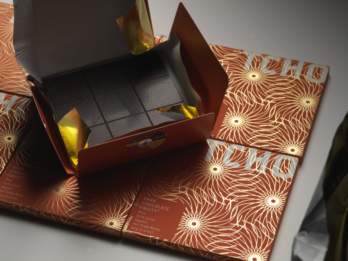
– We did the packaging design for the chocolate brand TCHO from San Francisco, which helped to place it on a luxury level – because the high-class packaging fitted perfectly to the high-class content. The packaging delivered information about the product inside – milk or dark chocolate, percentage of cocoa etc.
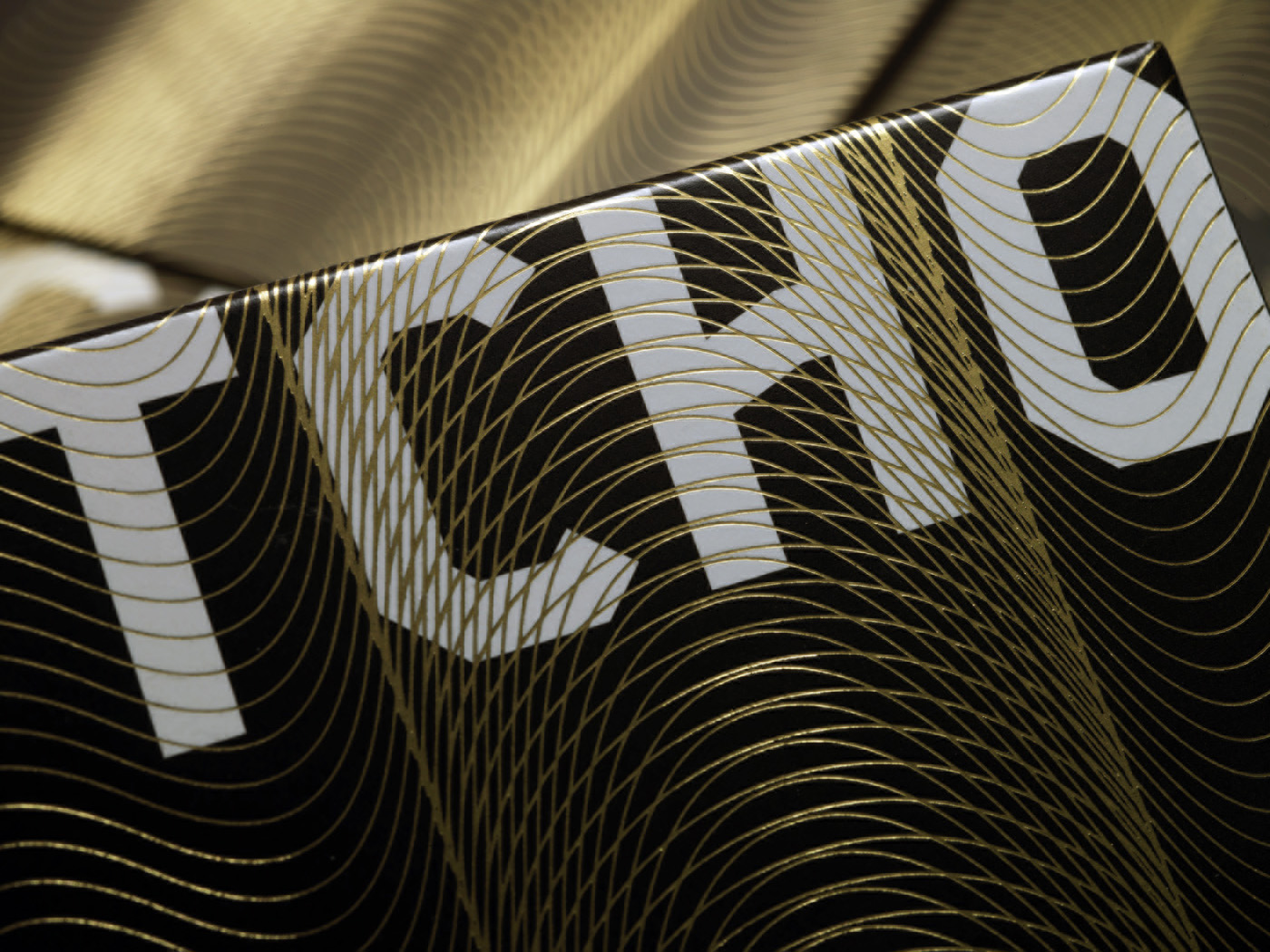
The elegant packages protected the product from breaking, at the same time being comfortable to handle. Our packaging design for TCHO has won numerous awards and honors, including the Academy of Chocolate Gold Award in February 2009, the European Design Gold Award in May 2009, the iF communication design award in August 2009, as well as nominations for the 2009 Cannes Design Lions and 2011 German Federal Design Award.
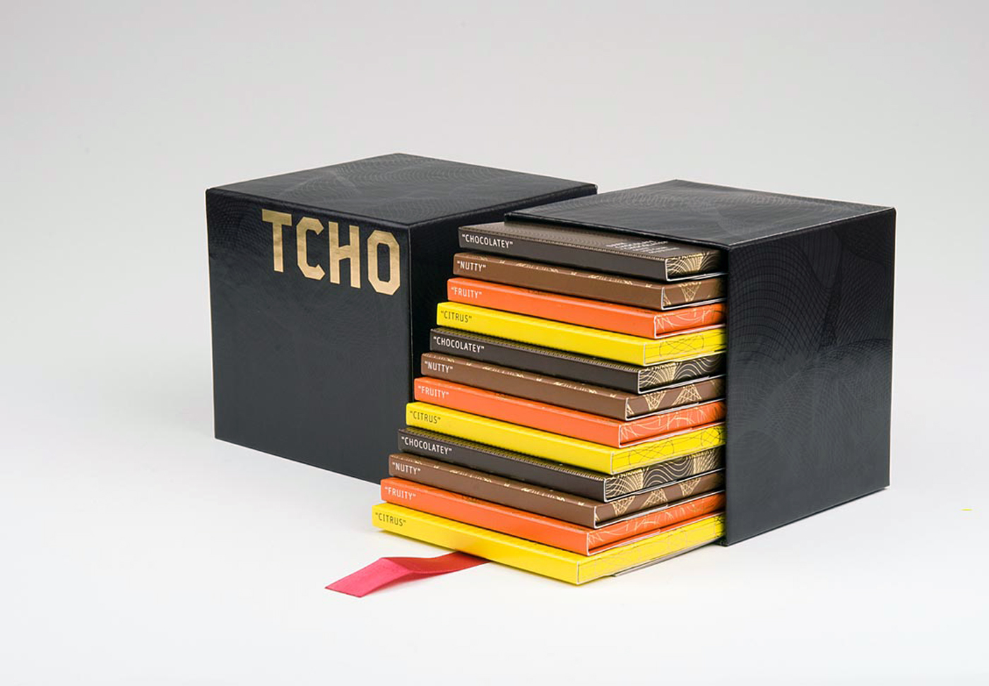 Our award-winning packaging design for the luxury chocolate brand TCHO, directed by Susanna Dulkinys, CEO of Edenspiekermann San Francisco.
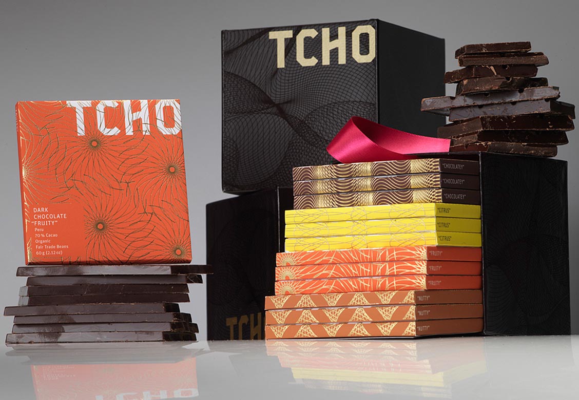
Beautiful, functional, and elegant to handle: with our work for the TCHO brand their product became unique in its market.
– Packaging is much more than some kind of wrapper for something you buy and carry home. Years ago we did the rebranding for Paulmann, a German company for light systems. With what seemed to be “only” a new packaging we established the Paulmann brand in broader markets and made them a leading player in their field. Our work for Paulmann has been featured in PAGE magazine and on Design made in Germany.
The package is the message – and sometimes a crazy video helps
Packaging will work for you. The food industry knows. In Germany, food chains like Kaiser’s, SPAR and Lidl have created their own product ranges via both functional and well-designed, recognizable packaging. Edeka has succeeded lately in presenting their brand as younger and cooler than the rest: first with the claim “Wir lieben Lebensmittel” (we love food) and a testimonial campaign, then with a half-crazy-half-cool video which has got nothing to do with food, actually, featuring Berlin artist Friedrich Liechtenstein telling you how “supergeil” (cool, awesome) a colleague you are. “Supergeil” has become a viral speed ball and made the Edeka brand cool over night. Hopefully the market experience of their users is at least half that cool (including the products they encounter there).
Gain new target groups
The Edeka video is maybe the most extreme form of turning to totally new target groups lately in this sector, but there are more. For example the very traditional Swiss chocolate brand Lindt with their new product range “Hello”: a totally different brand appearance, with a name, a packaging and website on its own and no link to the “old” brand. Especially the appearance of the product with the totally new packaging differs from what users are used to.
A parallel world turning mainstream
The whole issue gets really striking when we look at organic markets. In cities like Berlin, London, San Francisco, … organic supermarkets and food chains shoot up like mushrooms. Of course they compete in the look of their shops, not very successfully, as the logos have all to be green, obviously, and look delicious. But along with this boom comes a boom in organic food, and brands for organic food.
No longer do we have those strange small organic shops with two depressing carrots and a dubiously small salad awaiting us, jam with labels somebody painted on their farm with their children, and sugar bags that would tear apart the moment you try to open them. Organic shops are not longer a niche thing where only weirdos go with “correct” political attitudes. Organic supermarkets almost turned mainstream, becoming a natural (sic) part of many people’s lifestyles. And along with this development come ranges of new products and brands that have to compete in packaging and quality of their appearance.
One of the nicest examples is the organic spices range by Herbaria, a traditional German company existing for more than 80 years: beautiful packaging, great design with a splendid color range and excellent type, plus cool naming matching the first-class ingredients: not just salt and pepper, but “Steinsalz” (Sicilian rock salt that has matured for over 100 million years under a mountain, minded carefully by local miners) and “Trio Noir” (a well-balanced pepper-blend combining black peppercorns from the Indian Malabar coast, Sri Lanka and Tanzania).
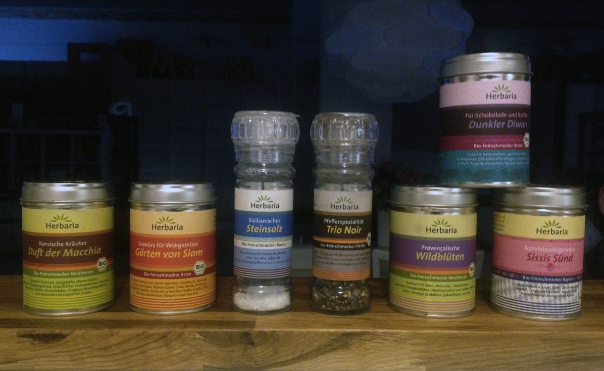
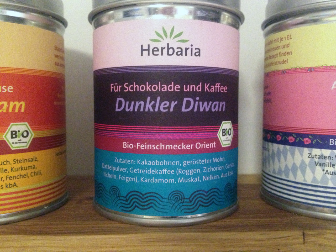 Colors and patterns make the complexity of flavours visible: organic food producer Herbaria started their redesign in 2007 – and established themselves as a premium brand in the food sector.
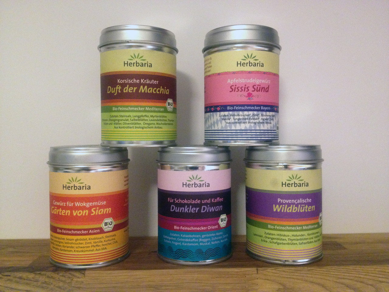 Not just a packaging, but a product that make consumers stop, smile, buy – and stay with the brand. Design by Sophie Seitz, Munich, type family TheSans by Luc(as) de Groot.
Herbaria’s “Organic Gourmet Seasonings” range from “Orient” via “The Americas“ and “Mediterranean” to “Asia” and “Basics“. The spices for “New German Cuisine” for example include mixctures named “Waldeslust” (joy of/in the forrest) or “Himmel und Erde” (sky and earth), referring to traditional German dishes and cultural codes.
In short: here we have a perfect branding thanks to beautiful packaging. The handsome Herbaria spice mills and aluminium boxes are both easy to use and an eye-catcher in every kitchen. Beauty and perfect function of the packaging go hand in hand.
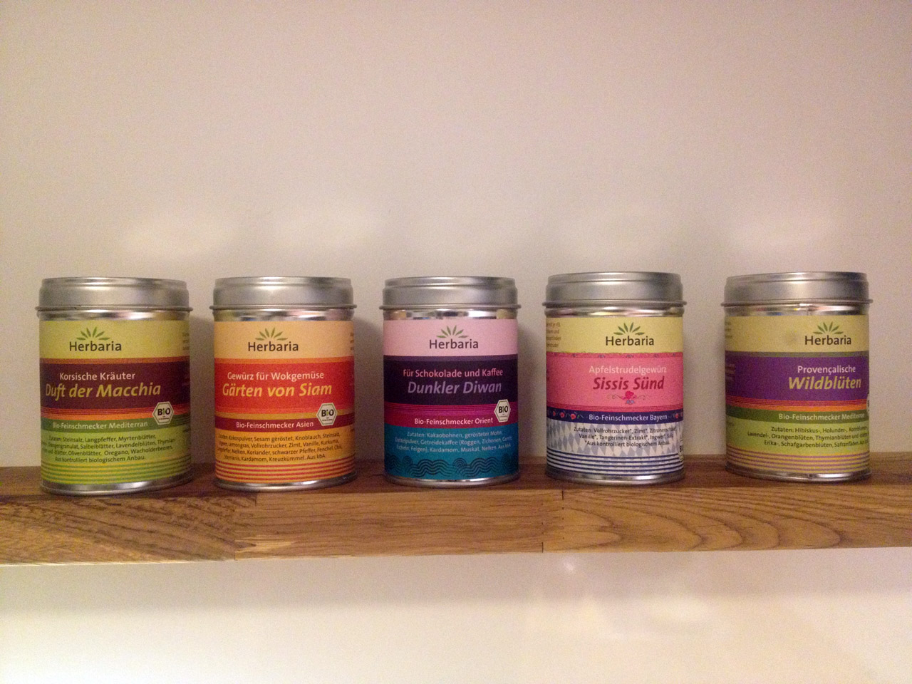
And nobody would even think of buying anything else after tasting, touching and using that kind of “salt and pepper” (organic or not). Thus, even simple spices can turn into stylish must-haves via packaging. That is what beautiful, functional product packaging is about: it can make your brand unique.
Photos: Edenspiekermann