Article
ESPI at work: The power of Keynote

Stop the press: There exists a world outside of the Adobe Creative Suite. And it’s called Keynote.
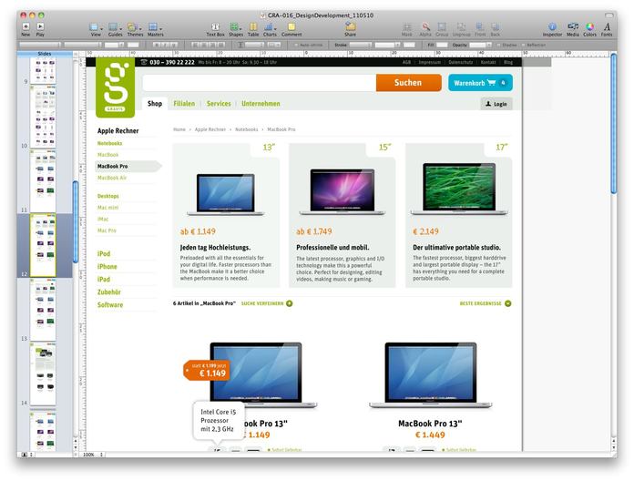
I should start by saying I am by no means a Keynote ‘pro’ compared with many of our web team who could use it in their sleep. In fact, when I first started working at ESPI last July, I was very surprised to find out that designers were using Keynote for laying out presentations. My surprise turned to alarm when I found out that they were also using it as a design tool to build UI designs for websites and apps. It turns out that I was absolutely wrong. Keynote is an incredibly powerful design tool. Less then one year later, I now rarely (if ever) use InDesign to layout presentations, and I have started using Keynote almost exclusively for any web layouts I do. And not just UX wireframes, but full UI designs. On a recent project, I also used it for poster mock ups, banner designs and a bunch of other formats.
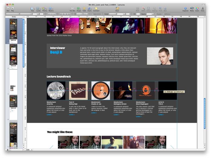
Most of the web team here at ESPI are what I like to call Keynote aficionados. They use the program for virtually every project, rarely dipping into Photoshop except occasionally to create some small graphic elements. An example of this is Red Bull Music Academy website that was completed last year. With the exception of some vector iconography created in Illustrator, it was all designed in Keynote.
Why use Keynote?
This is by no means a definitive list, but here are some of the key features for a designer using Keynote.
1. Ease and speed of use
It's made by Apple, so this is a given. Nonetheless, Keynote’s ease of use is still worth a mention, as it is exceptional. No more ‘placing’ images or videos, or worrying about missing files – all the images, videos, etc. are embedded directly in the document. In turn this makes it extremely efficient allowing you to work at a very fast pace. The web team at ESPI often move from sketch to Keynote quite quickly and have a very tangible result. It is much faster than Photoshop. Speed of mock ups works well integrating into an agile workflow –the team only develop mock ups with enough detail, then goes straight into code where they can iron out the details and polish. Also, if you can’t do it Keynote, it is unlikely you could achieve it in HTML/CSS.

2. Flexibility and non-destructive editing
One of the most powerful features of Keynote is that is will take virtually any file that you throw at it. Images, vectors, video, audio, etc. can all be simply be dragged or pasted into your work area. Once in the work area, they can be resized nondestructively. This adds huge flexibility to your workflow, as the same layout used for web can also be printed at a lovely 300dpi. This is particularly useful for iPhone/iPad design, as it means a single source version of artwork for Retina and non-Retina displays. Keynote files can be exported as QuickTime movies, PDFs, HTML or image files, or if you really have to, a Powerpoint file.
3. The cleverest grid lines I have ever met
It’s almost as if these lines can read my mind. I want equal space between these images? No problem. I want the centre point? Easy. I want these irregularly sized objects to all line up perfectly? Done. These lines are particularly useful for UI layouts; automatically creating equal gutter widths that all other objects snap to. In short, these yellow grid lines are magic – it’s like having your own Josef Müller-Brockmann inside the interface.

4. Animation tools for prototyping
When you combine the words ‘animation’ and ‘presentation software’, it instantly evokes unpleasant memories of garish PowerPoint presentations you were forced to sit-through in high school, complete with sparkly ‘animate-in effects’ and probably some Comic Sans. Park these bad memories when it comes to Keynote. The animation tools are powerful, tasteful and tremendously effective. In particular, the ESPI web team uses them frequently for app mock ups to demonstrate functionality and walk-throughs of features. These Keynote documents can then be played full screen on an iPhone/iPad, giving a real demonstration of an app’s UI experience for a client. The narrative structure allows you to visualize flows and interactions better, meaning you get working prototypes that look real faster.
When the web team were developing prototypes in a service design project for Volkswagen, the native Keynote app didn’t cut it at the time (because hyperlinks were not supported), instead they linked everything using the hyperlink tool, then PDFed it and used the Good Reader app to demo it to clients and use in user testing.
Keynote can also be used to prototype animation moving storyboards, which will later be polished into motion graphics in After Effects. For example, Erik has used the tool to sketch an animation for Deutsche Bahn.
5. Third party add-ons/libraries
Many resources/libraries are available (often for free) to make visualization and mock ups even faster (e.g. mockapp, Keynotopia). Also when you combine this with tools like Glyphish you can have testable solutions quickly rather than getting bogged down in details.
Conclusion
Of course, this is not to say that Keynote is perfect. I’m still getting used to not having the usual set of Adobe hotkeys, the Keynote ones are quite limited. Also, I really miss things like graphic styles and proper tools for drawing vectors (there is a Bezier tool, but it is very limited). Another issue is the lack of detailed kerning options, although to be fair, the typographic tools in general are good. Some basic blending options (Multiply, Overlay, etc.) would be the proverbial icing on the cake. I have my fingers tightly crossed that some of these features is incorporated into the next release. And, knowing Apple, it’s very possible that some of them will be.
Keynote has worked its way into the ESPI workflow, and for good reason. The team here continues to push how this powerful design tool can be used, and it is exciting to imagine what will be possible with it in the future. It is available on the Mac App Store if you haven’t got it yet.
BTW: This article has been translated to Serbo-Croatian language by Jovana Milutinovich from Webhostinggeeks.com. Great job, Jovana! Thnx a lot. :-)