Case Study
Hering Berlin

A modern expression of porcelain
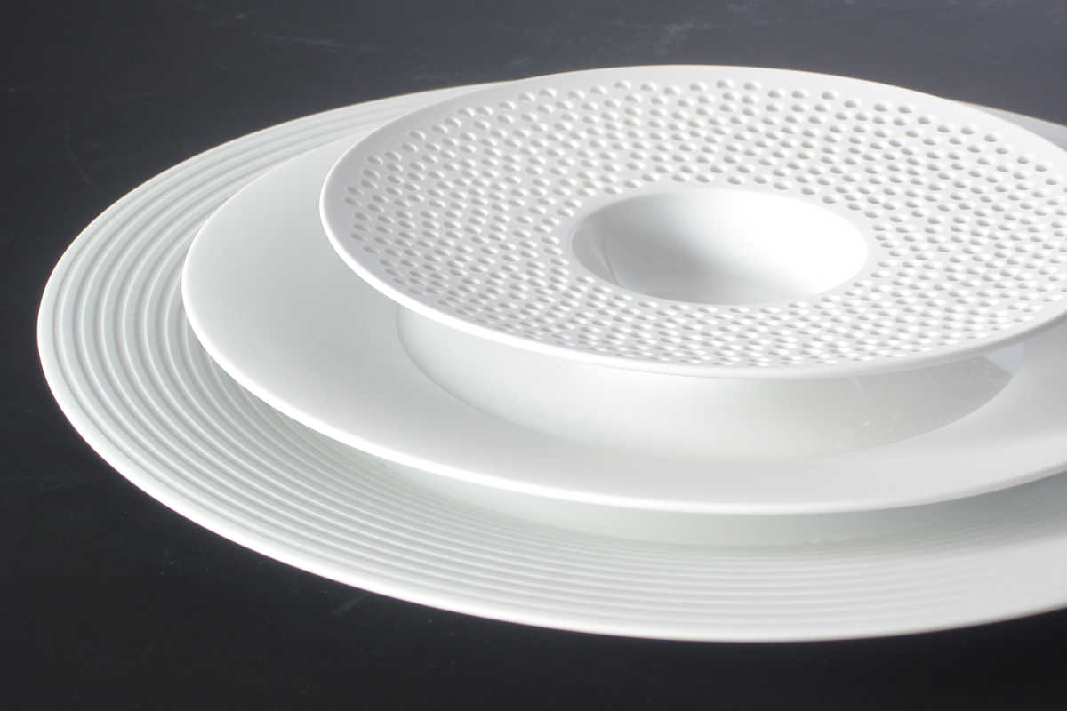
Porcelain is not just porcelain – that’s what Hering Berlin stands for. Its purist form, together with the highly individual combinable collection, sets a new international standard. Hering needed a concept to decide what was special about the brand, and how that could be communicated.
All innovations have a background, and so we stress that Hering’s story be told clearly. It is captured in a new kind of image concept that shows the porcelain in unusual perspectives.
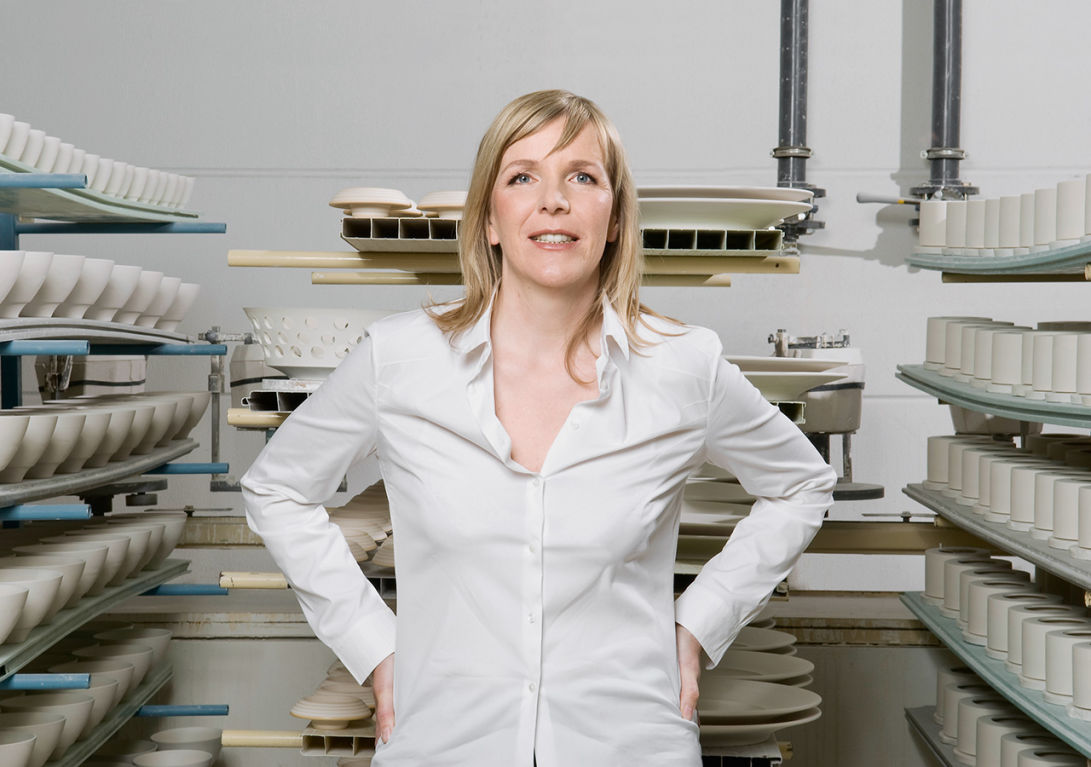
We are surprised and excited to see how well the design now reflects the core of our products, and the core of our philosophy. This is really us.Stefanie Hering, Chief Design Office


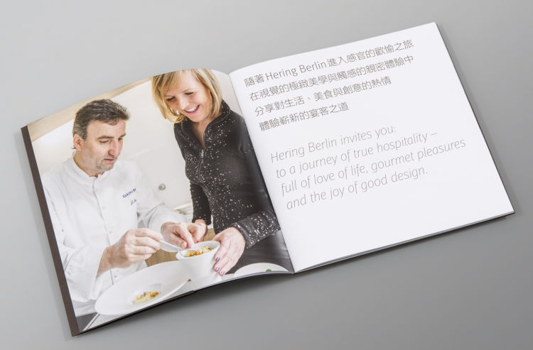
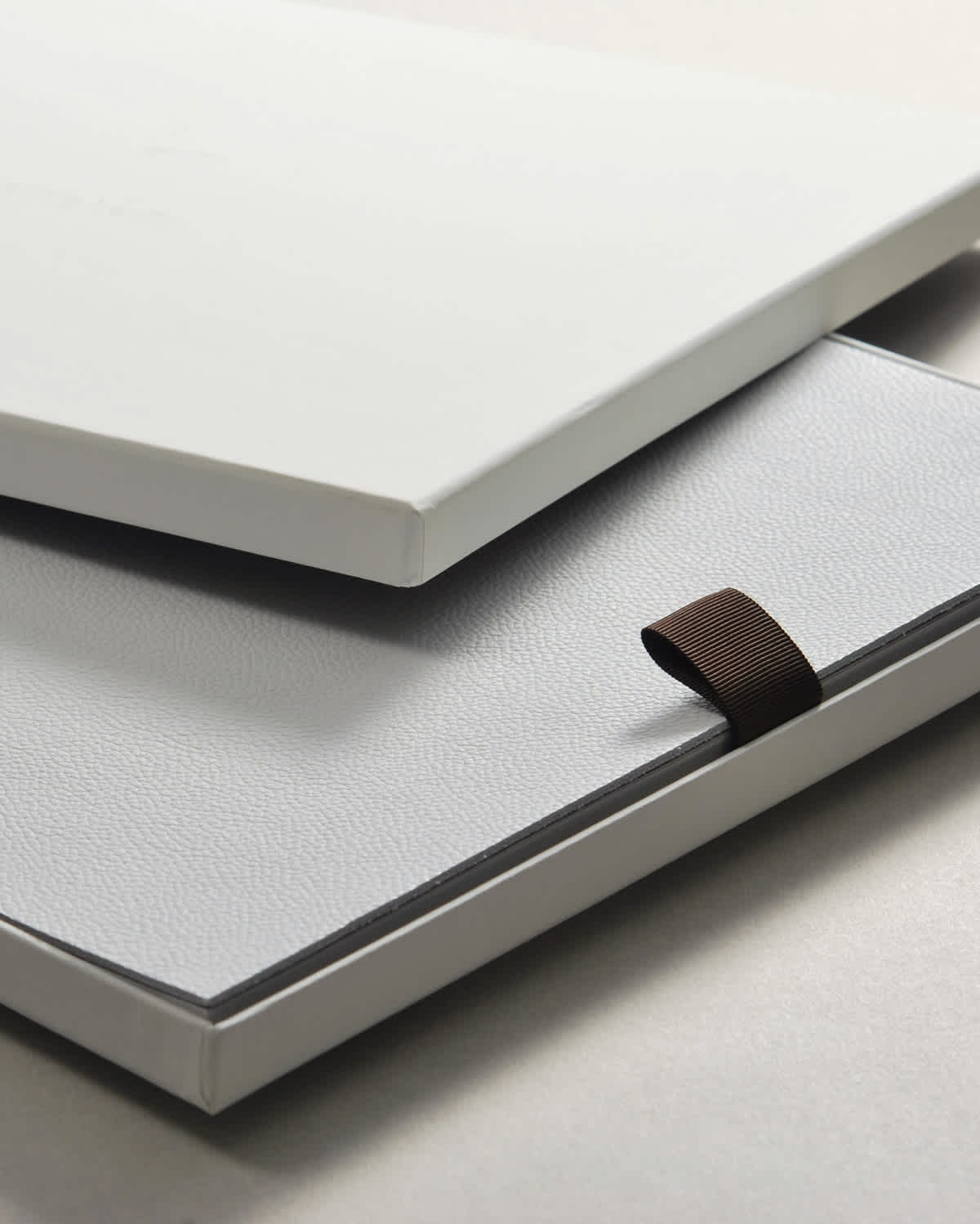
The complex shapes and decorations of Hering porcelain come to life in the image brochure; blind embossing, die cuts, metallic paints and spot varnishes make the porcelain look as lifelike as objects can possibly get in print. There's also the 700-page general catalog with the highest standard of clarity and design. No wonder, then, that the company’s appearance has caused such a stir in the industry. The product catalog and the brochure won a Silver European Design Award in May 2009.
